
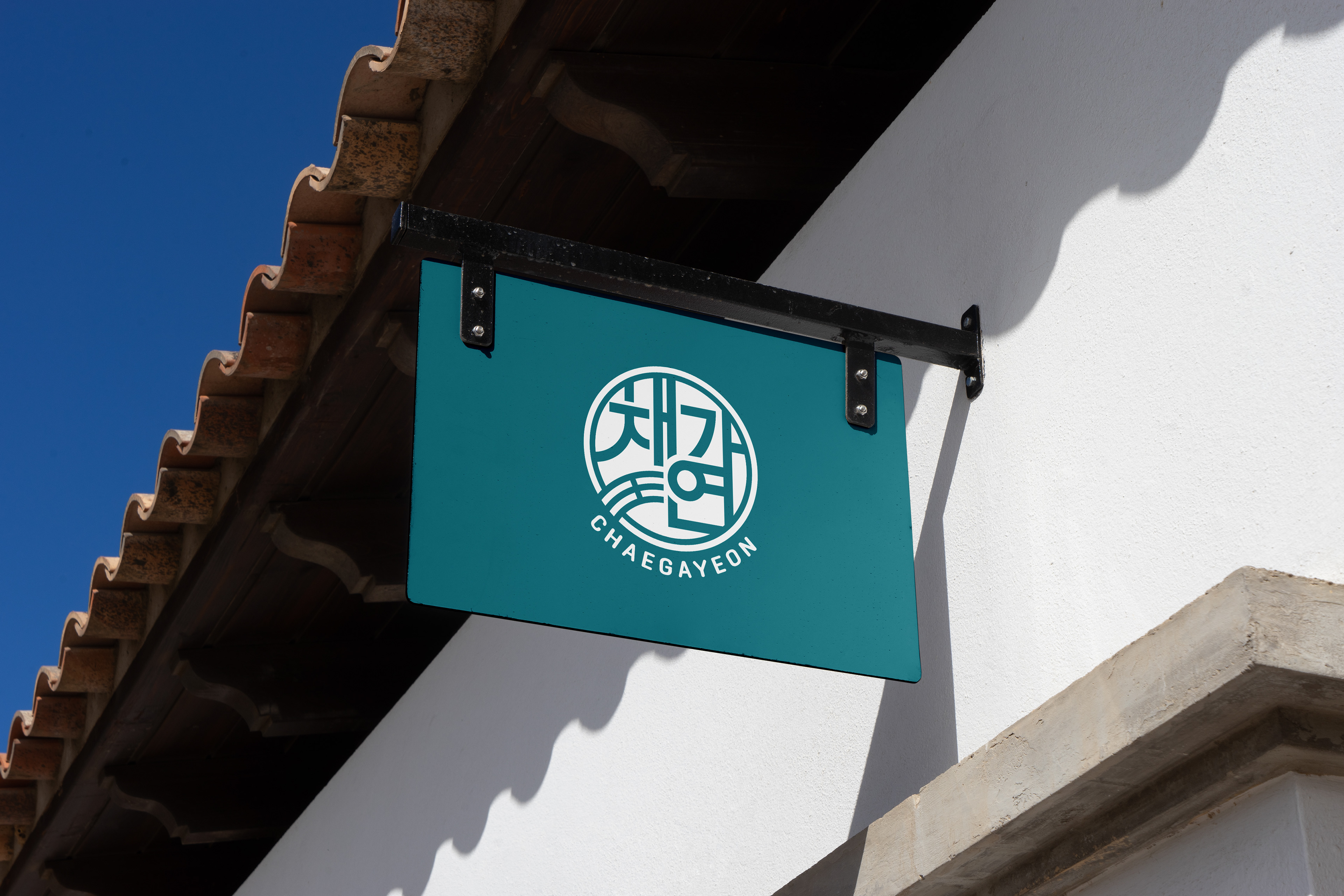
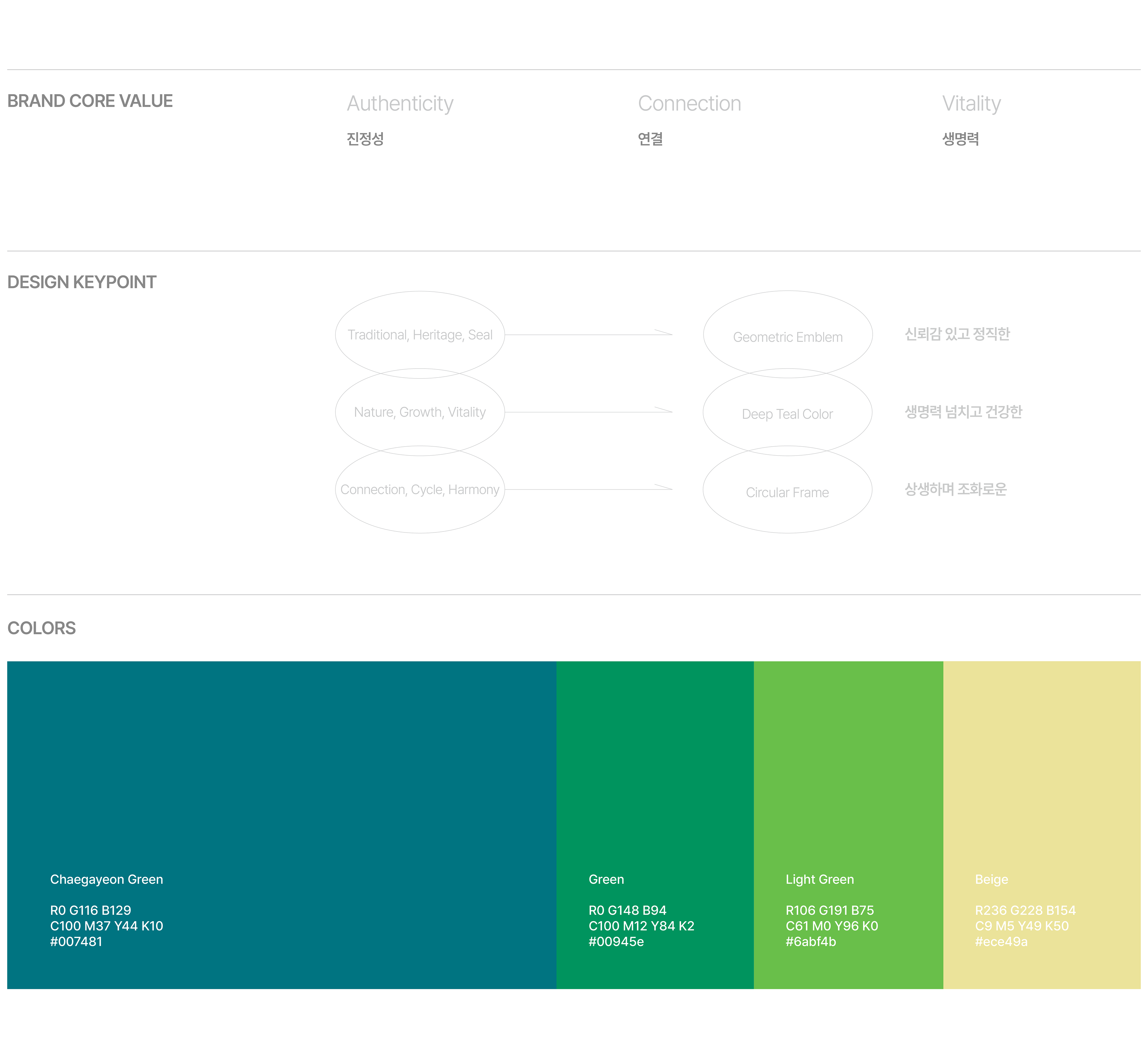
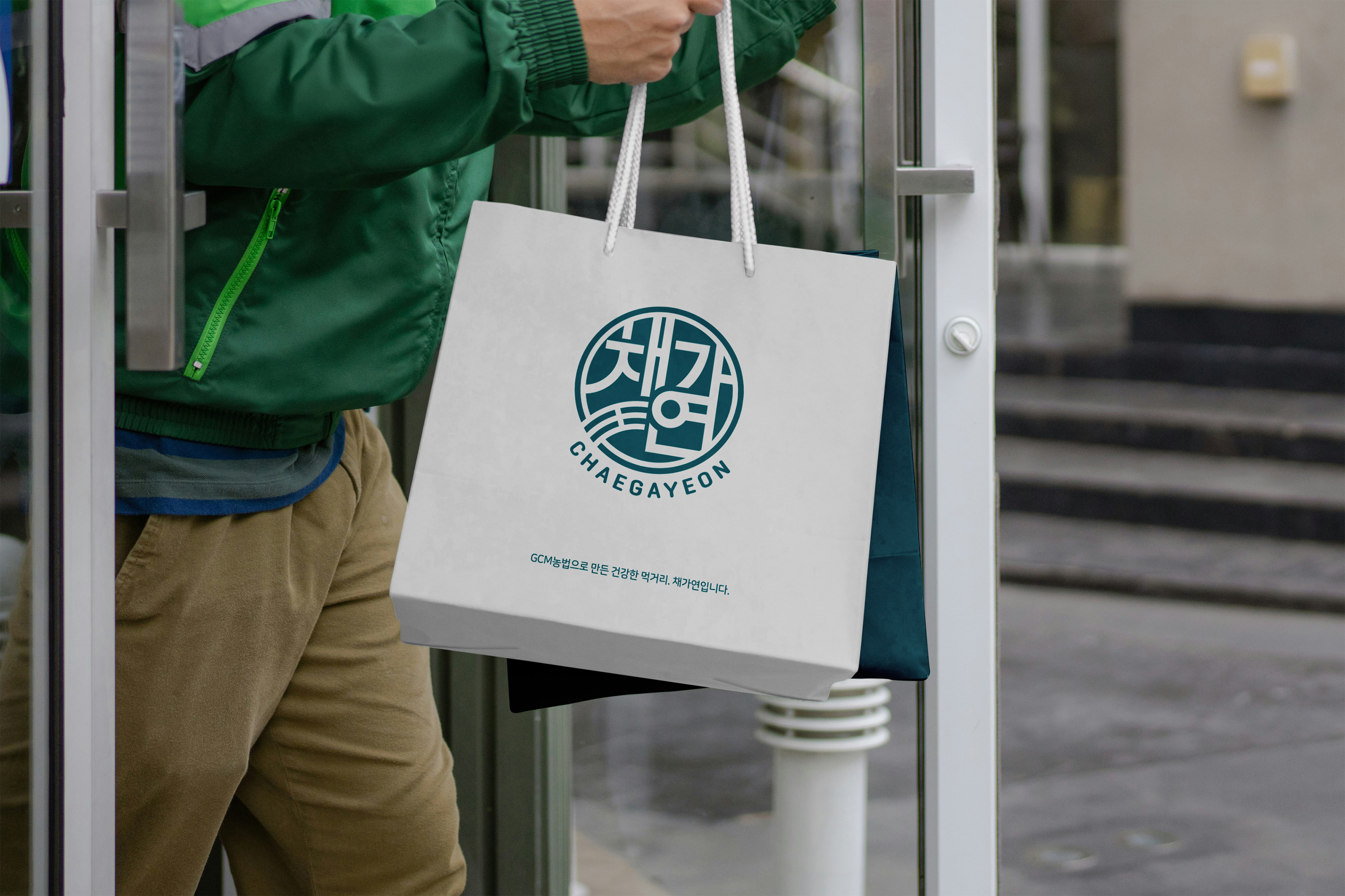
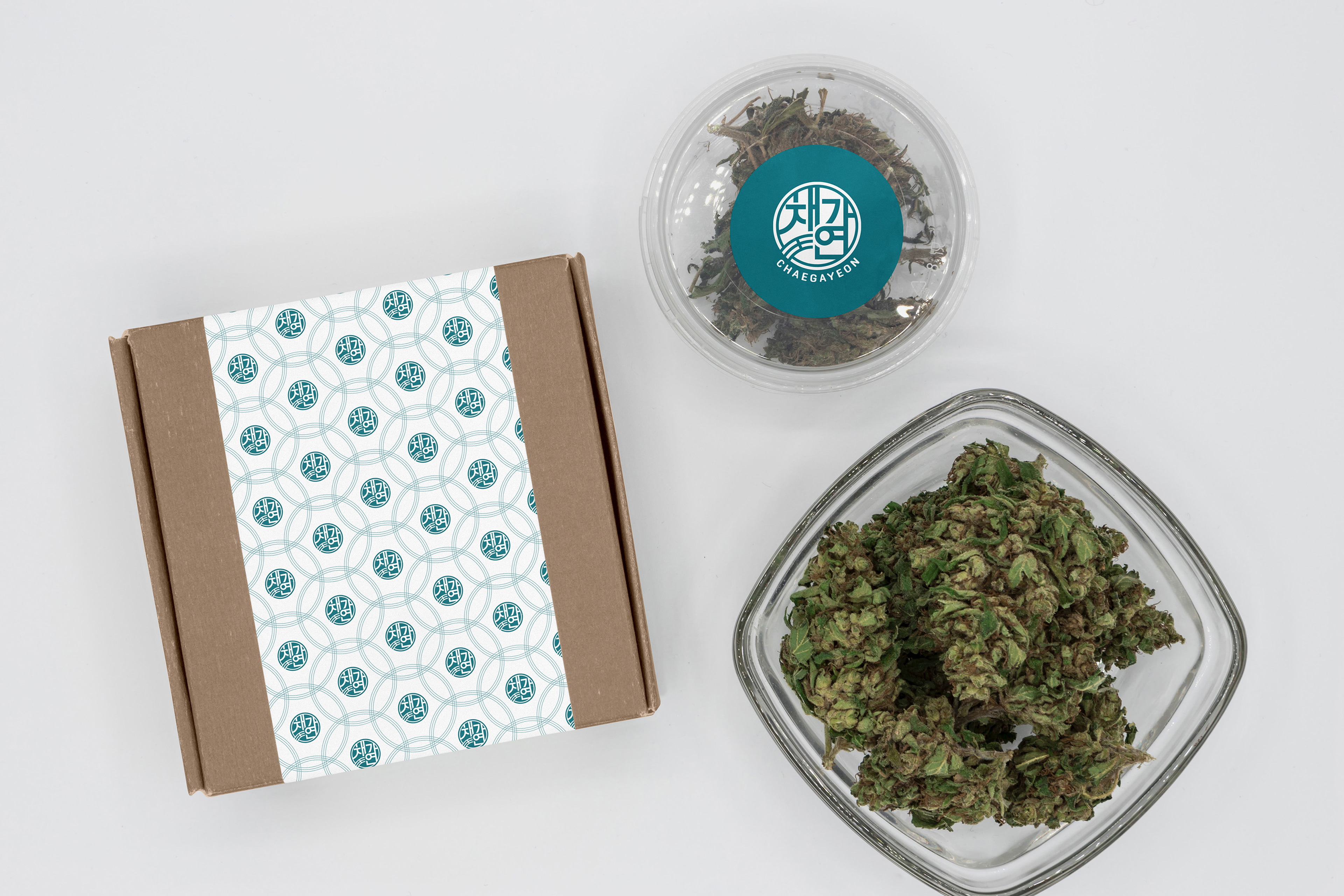
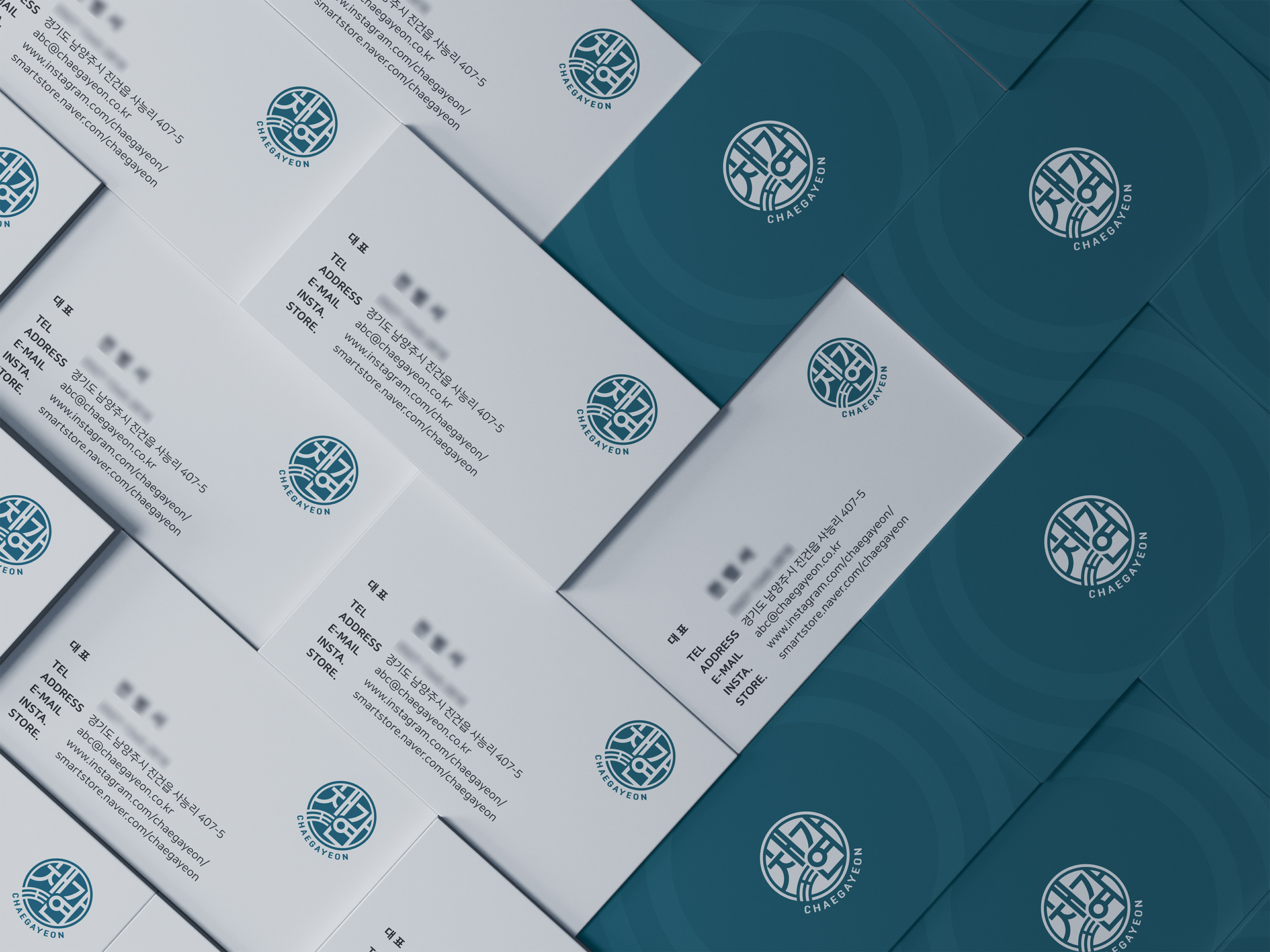
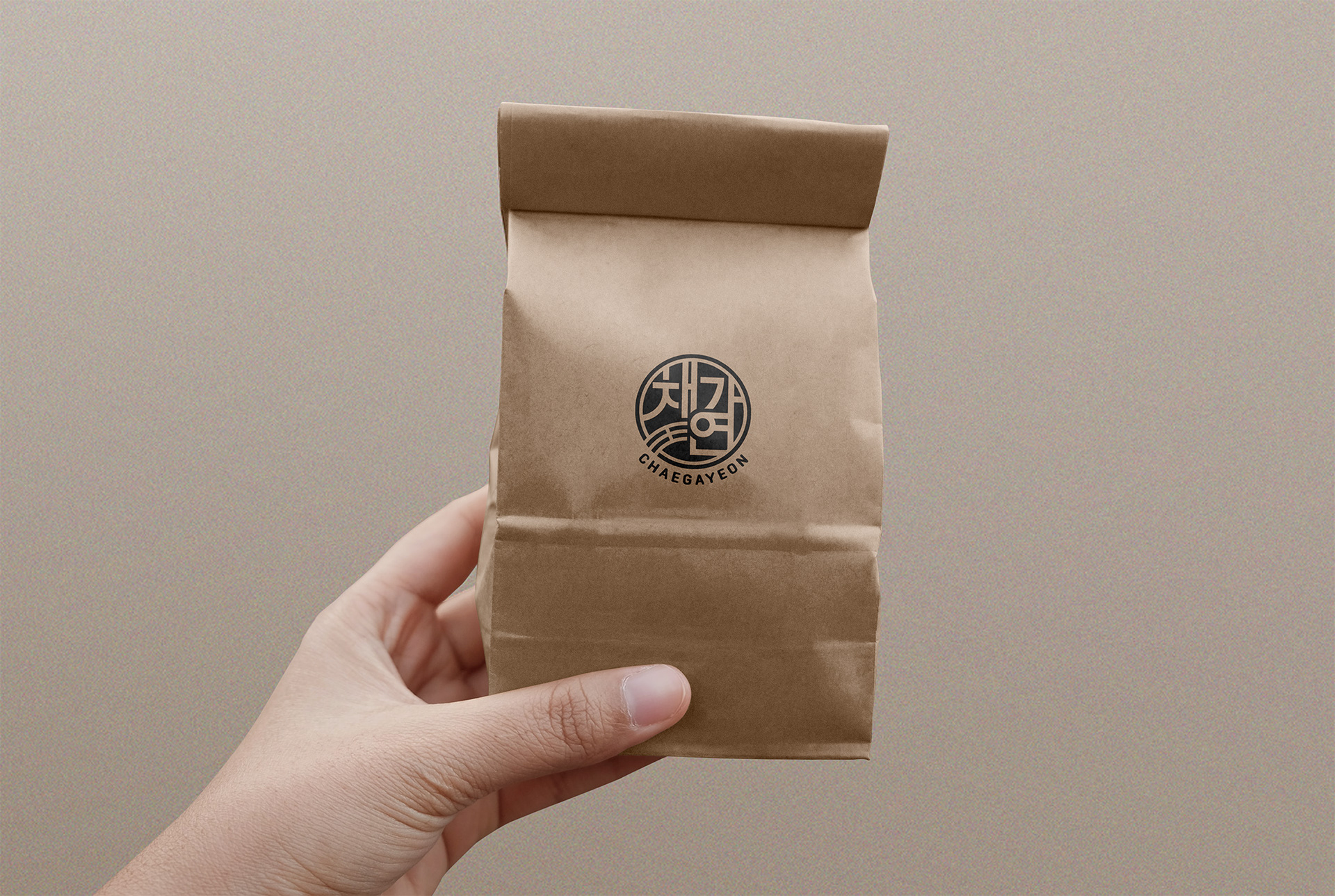
CHAEGAYEON is a premium agricultural brand that connects producers and consumers through healthy seedlings and agricultural products, meaning "a relationship to cultivate vegetables" or "a relationship to which vegetables are beautiful." The logo's circular emblem symbolizes completeness and co-prosperity, and the geometric structure reminiscent of the traditional door-to-door pattern visualizes Korean trust and honest quality.
채가연(CHAEGAYEON)은 '채소를 가꾸는 인연' 혹은 '채소가 아름다운 인연'이라는 의미를 담아, 건강한 모종과 농산물을 통해 생산자와 소비자를 잇는 프리미엄 농업 브랜드입니다. 로고의 원형 엠블럼은 완결성과 상생을 상징하며, 전통 문창살 패턴을 연상시키는 기하학적 구조는 한국적 신뢰감과 정직한 품질을 시각화하고 있습니다.
Chaegayeon Brand Design 2022
Year : 2022
Client : Chaegayeon
Services : Brand Design
Design : Soo Design Communication