

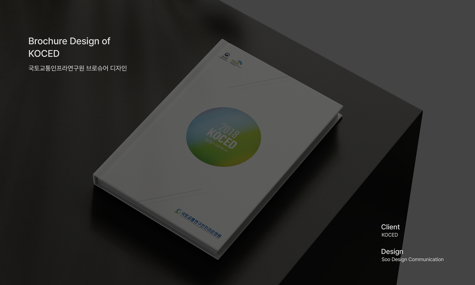
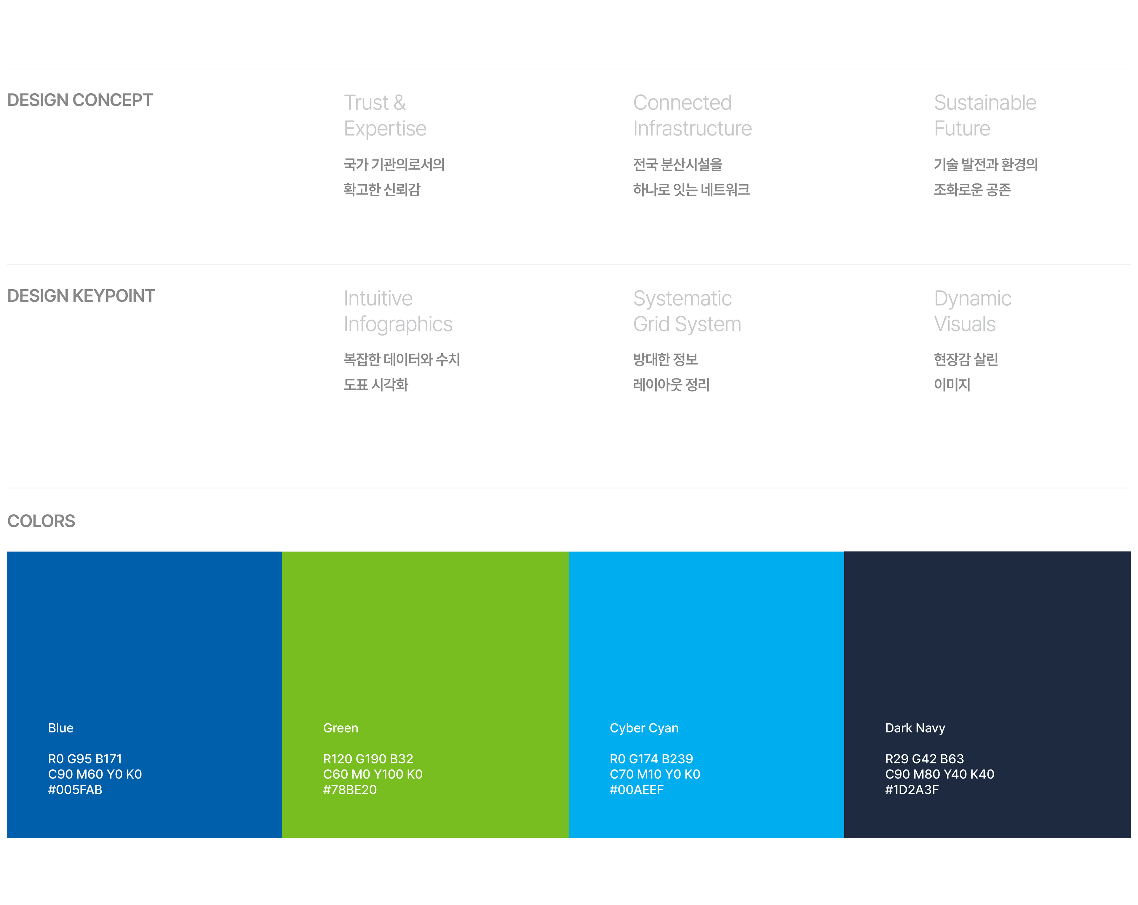
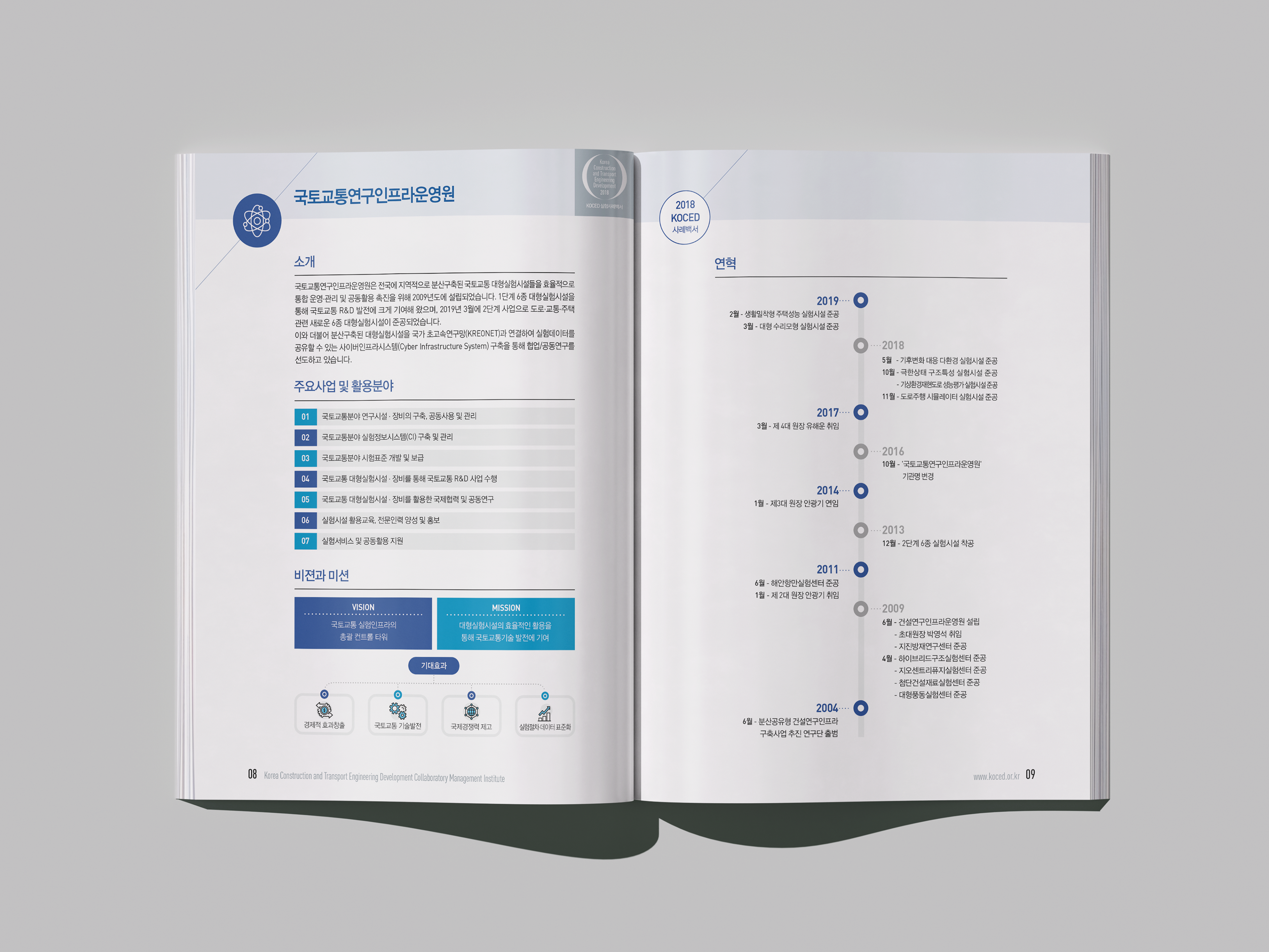
This project is a brochure design development by the Korea Institute for Land Transport Research and Infrastructure Operations (KOCED), and aims to effectively communicate its role as a general control tower for large-scale experimental facilities for land transportation to stakeholders. It gave visual trust and expertise by utilizing the institution's identity colors blue and green, and symbolized the harmony of construction technology and environment.
본 프로젝트는 국토교통연구인프라운영원(KOCED)의 브로슈어 디자인 개발로, 국토교통 대형실험시설의 총괄 컨트롤 타워로서의 역할을 이해관계자에게 효과적으로 전달하는 데 목적이 있습니다. 기관의 아이덴티티 컬러인 블루와 그린을 활용하여 시각적 신뢰감과 전문성을 부여하였으며, 건설 기술과 환경의 조화를 상징했습니다.
KOCED Brochure 2018
Year : 2018
Client : KOCED
Services : Brochure Design
Design : Soo Design Communication