

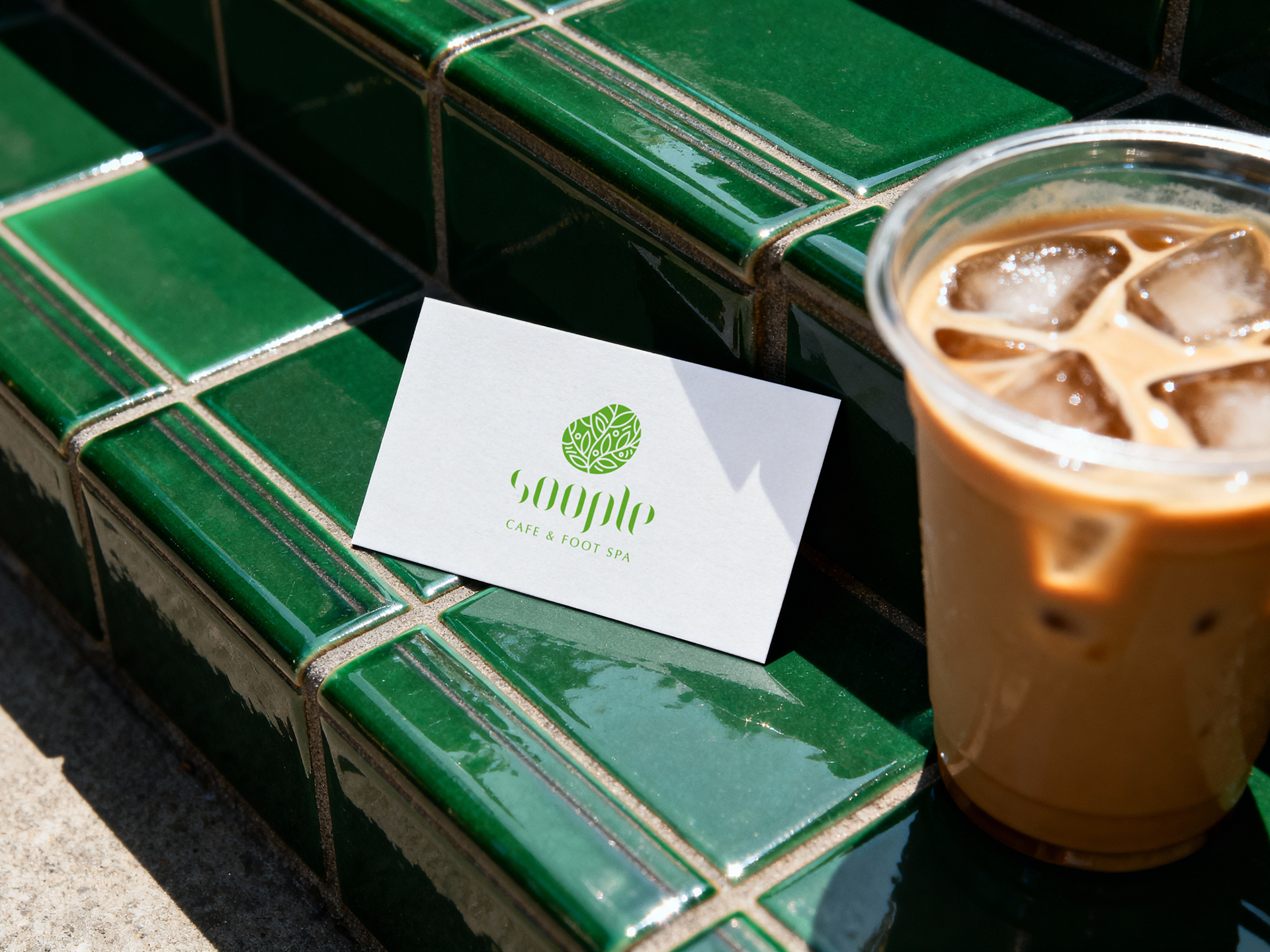
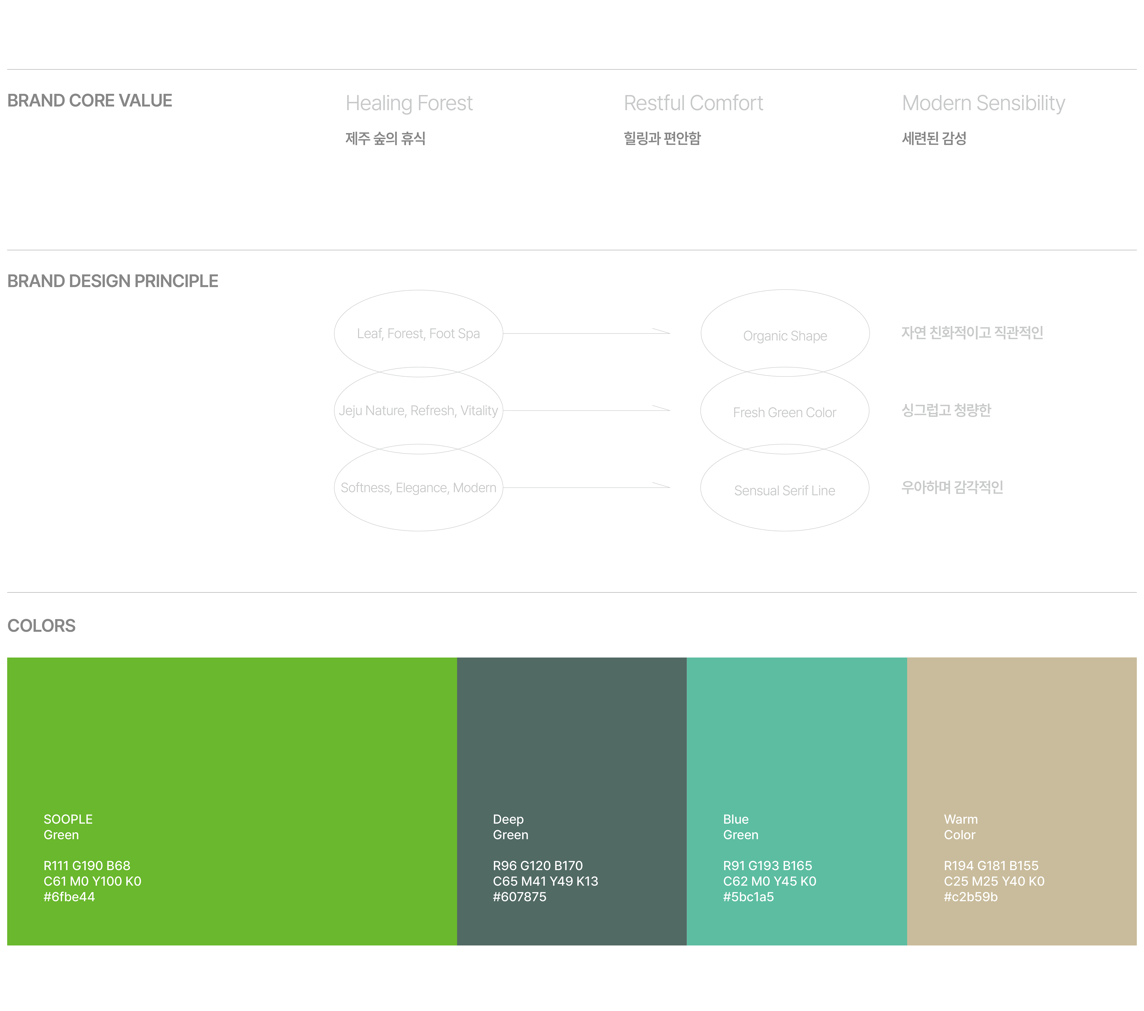
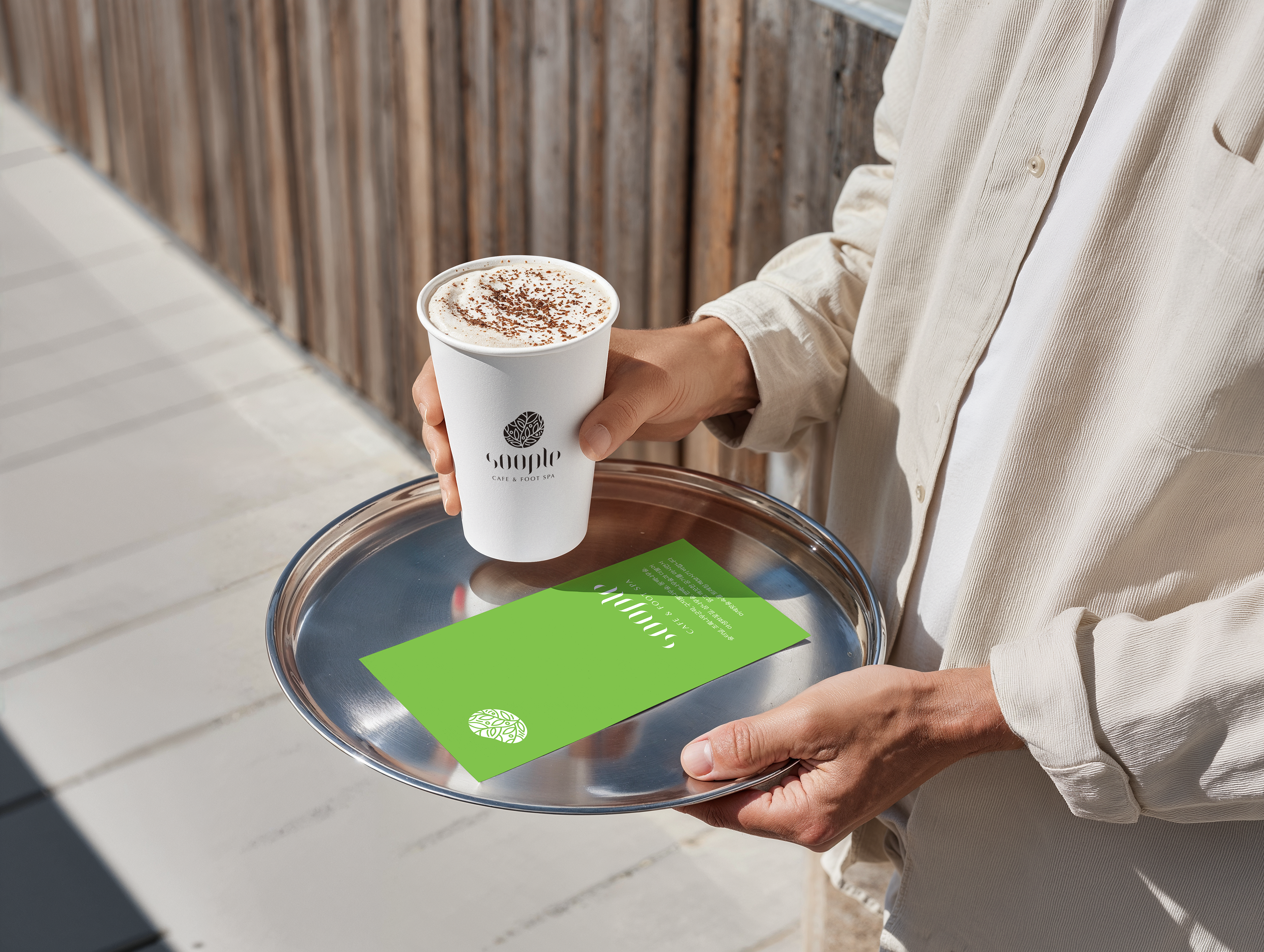
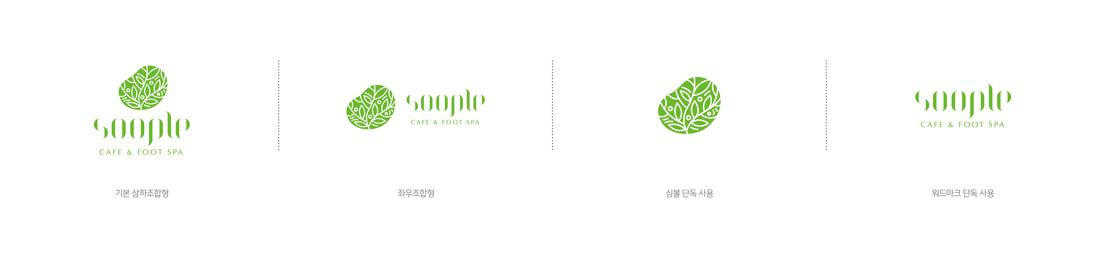
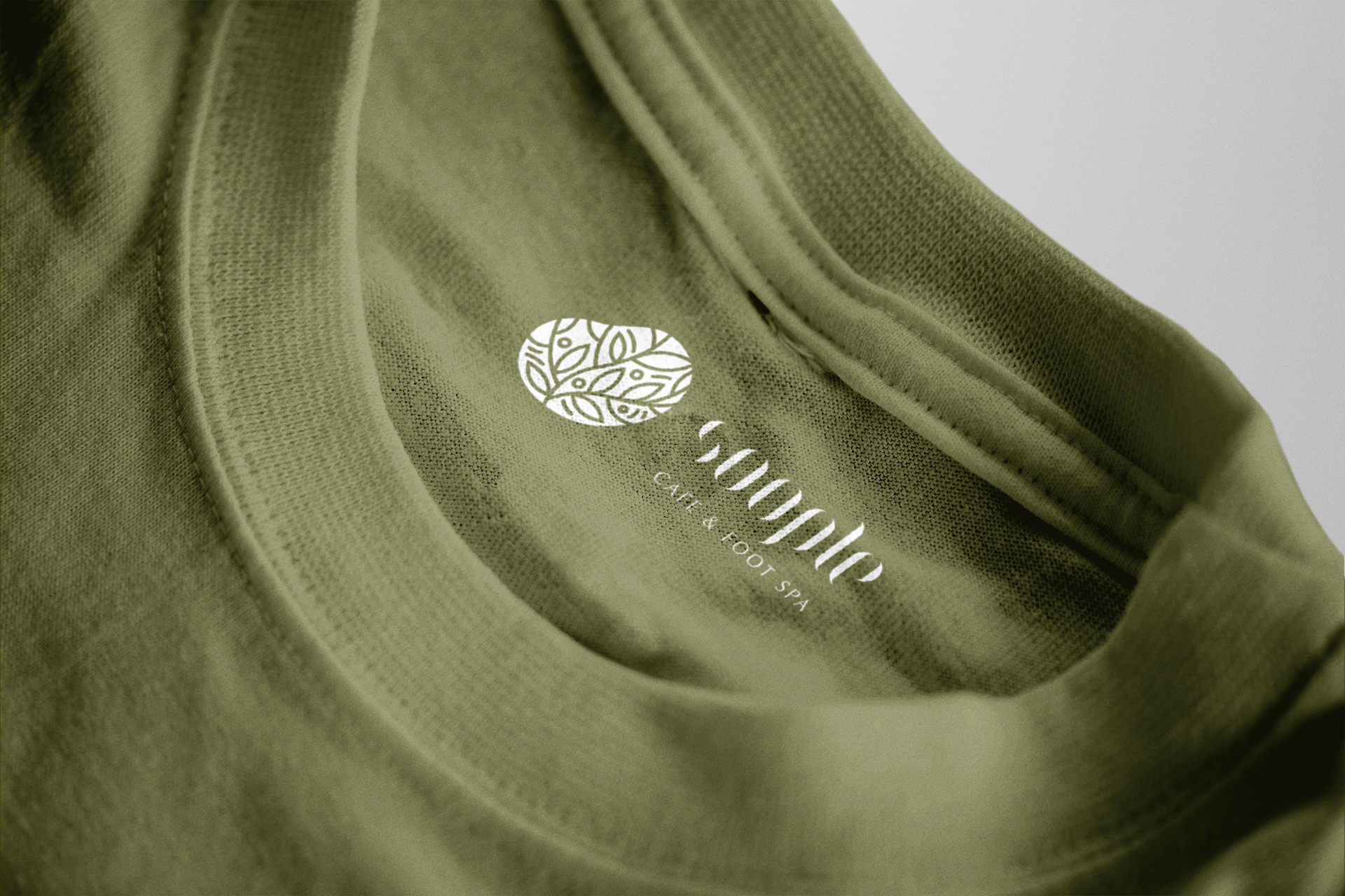
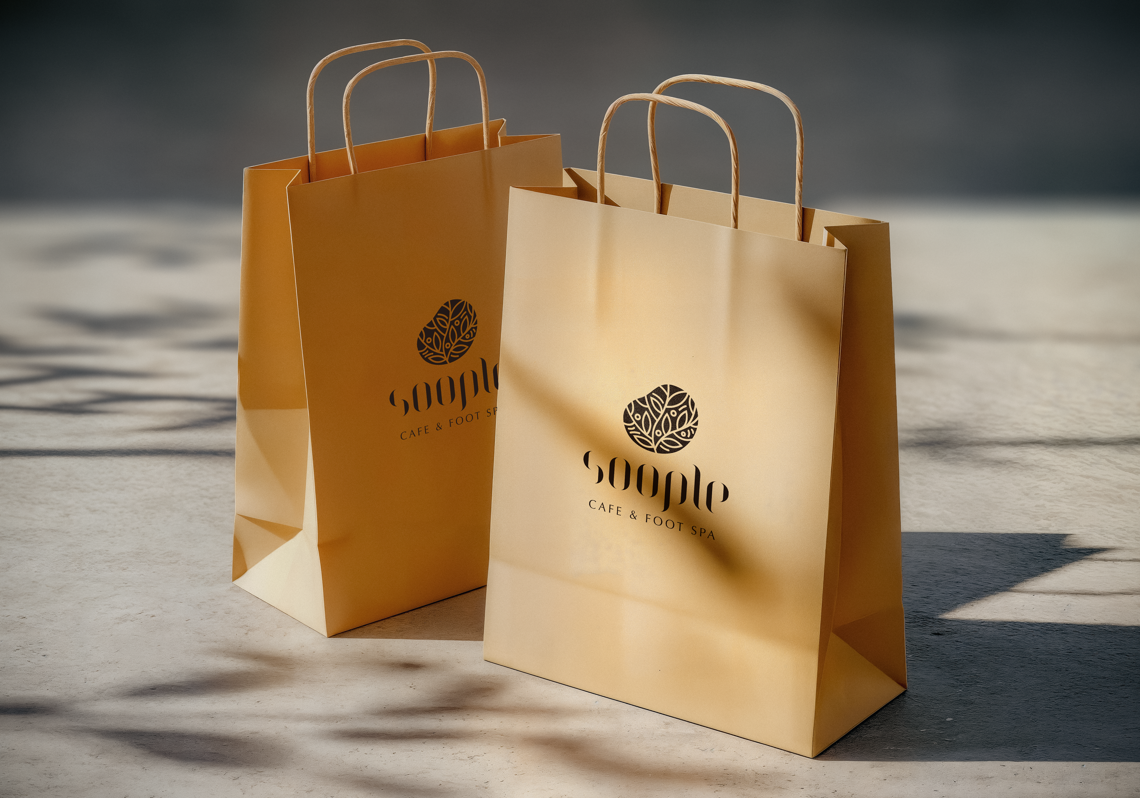
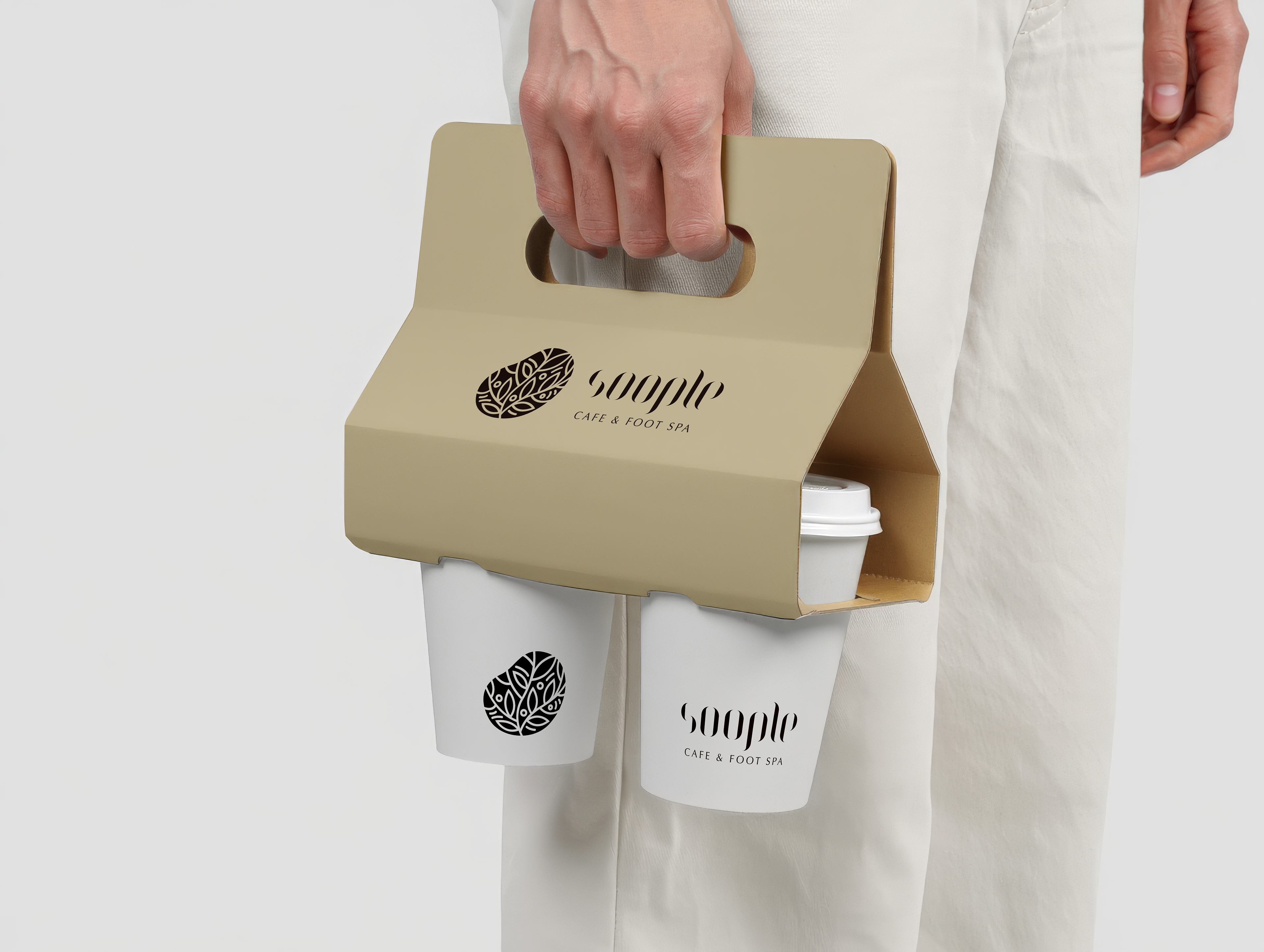
This is a brand logo design inspired by the concept of pure rest, healing, and foot baths in Jeju’s forests. By incorporating a symbol that evokes leaves and an organic silhouette along with a fresh green color, it creates a refreshing and eco-friendly image. In addition, modern serif typography with delicate curves stands out, completing the brand’s sophisticated and emotionally rich details.
제주 숲의 청정한 휴식과 힐링 및 족욕 컨셉을 모티브로 한 브랜드 로고 디자인입니다. 나뭇잎과 유기적인 실루엣을 형상화한 심볼과 싱그러운 그린 컬러를 적용하여 청량하고 친환경적인 이미지를 연출했습니다. 이에 섬세한 곡선미가 돋보이는 모던한 세리프 타이포그래피를 더해 브랜드만의 세련되고 감성적인 디테일을 완성했습니다.
SOOPLE Brand Design 2022
Year : 2022
Client : SOOPLE
Services : Brand Design
Design : Soo Design Communication