

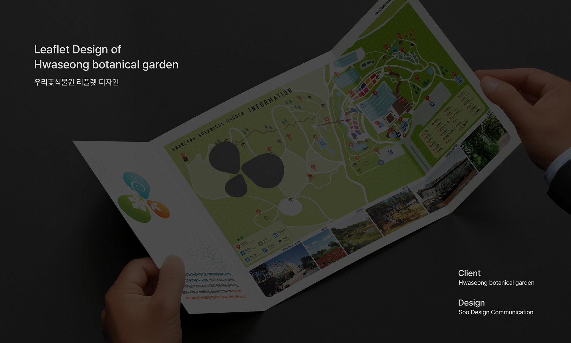
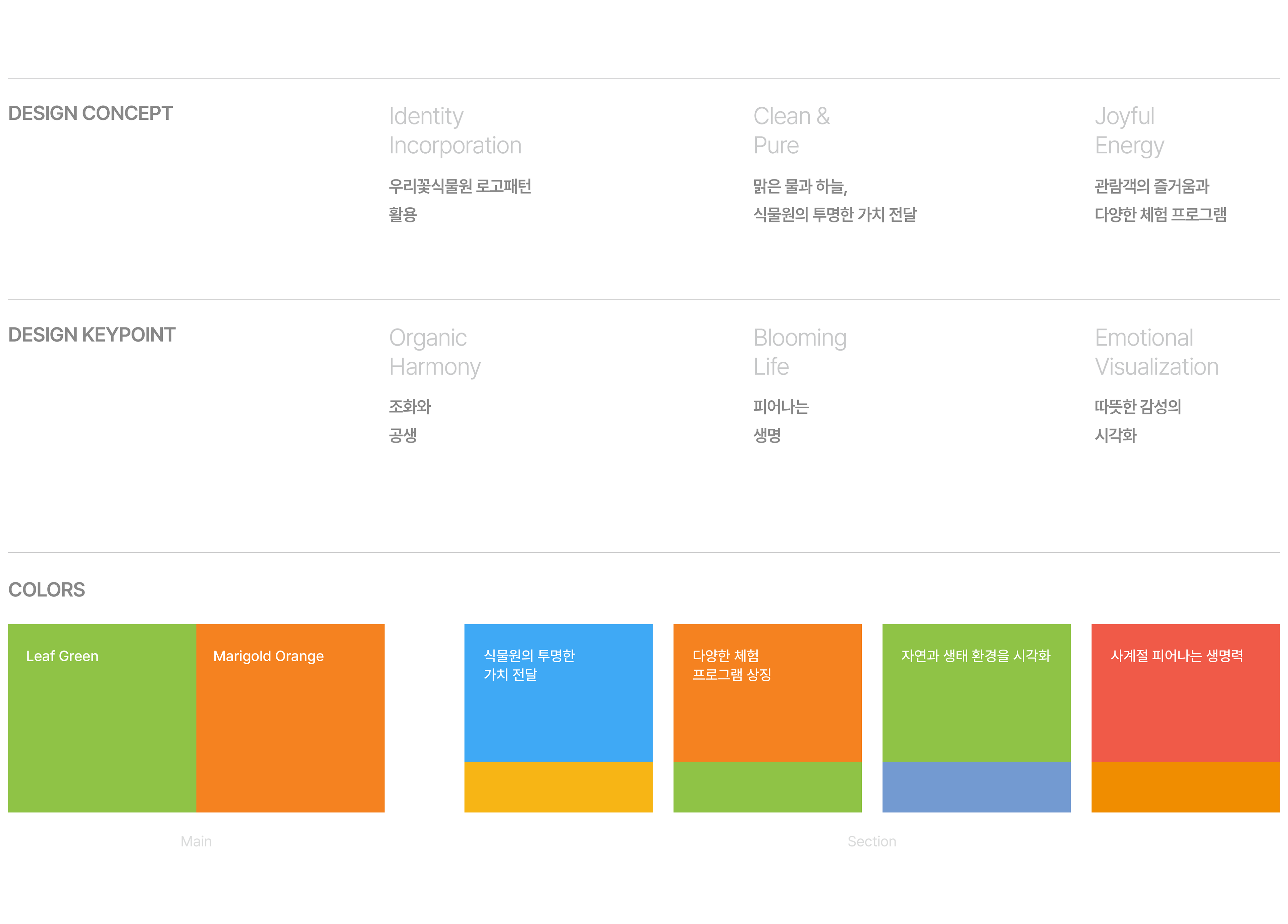
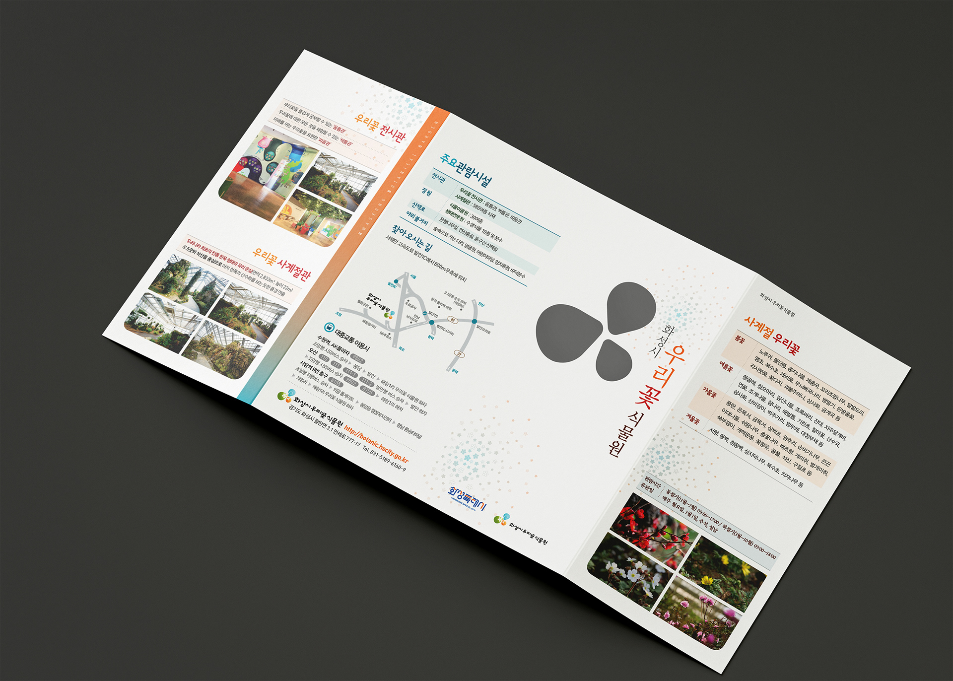
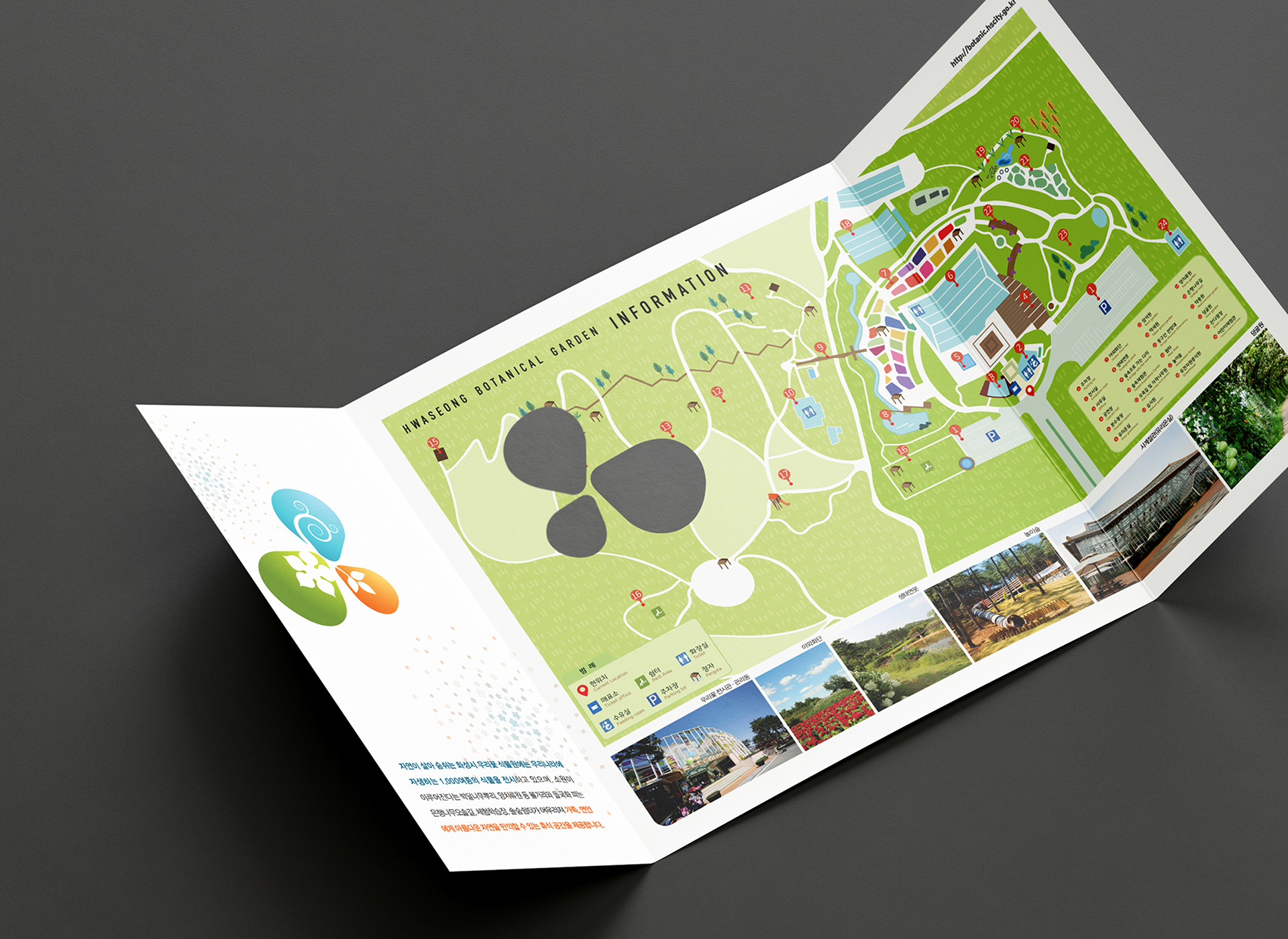
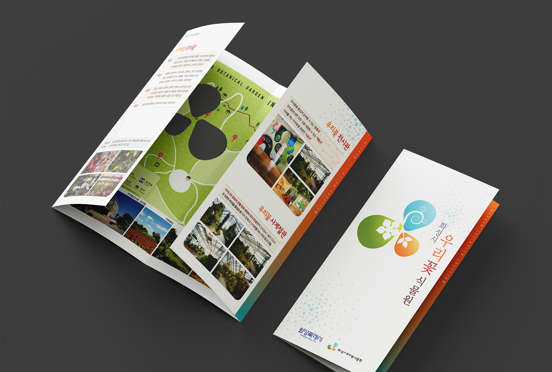
This project is the development of brochures at the Woori Flower Botanical Garden in Hwaseong-si, and aims to effectively deliver the beauty and viewing information of our flowers to visitors. The identity colors of the botanical garden logo, green, orange, and blue, were used to give visual unity and vitality. In particular, warm illustration maps were applied for family visitors to enhance readability.
본 프로젝트는 화성시 우리꽃식물원의 브로슈어 디자인 개발로, 우리꽃의 아름다움과 관람 정보를 방문객에게 효과적으로 전달하는 데 목적이 있습니다. 식물원 로고의 아이덴티티 컬러인 그린, 오렌지, 블루를 활용하여 시각적 통일성과 생동감을 부여했습니다. 특히 가족 단위 관람객을 위해 따뜻한 감성의 일러스트 지도를 적용하여 가독성을 높였습니다.
Hwaseong botanical garden Leaflet 2024
Year : 2024
Client : Hwaseong botanical garden
Services : Leaflet Design
Design : Soo Design Communication