
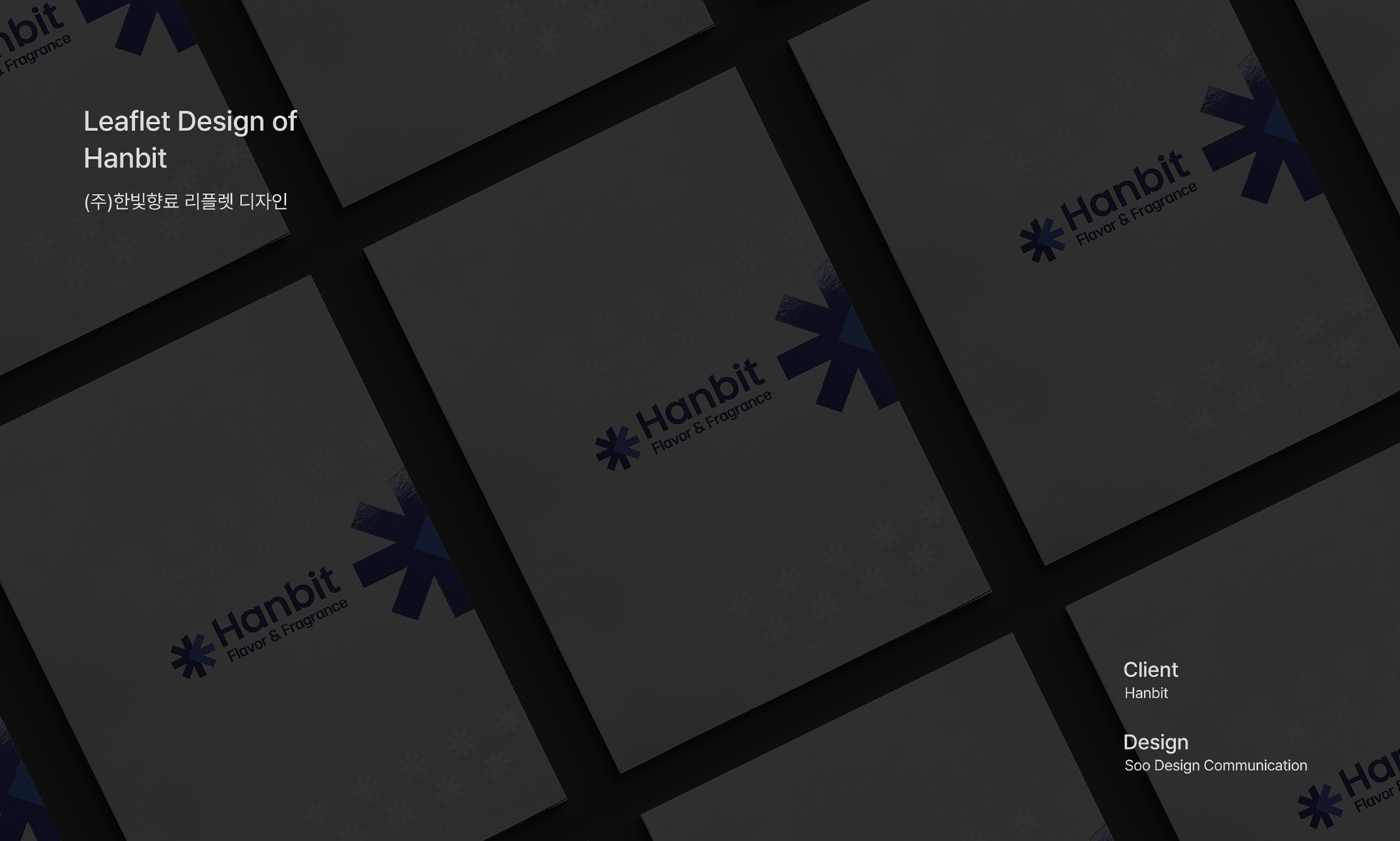
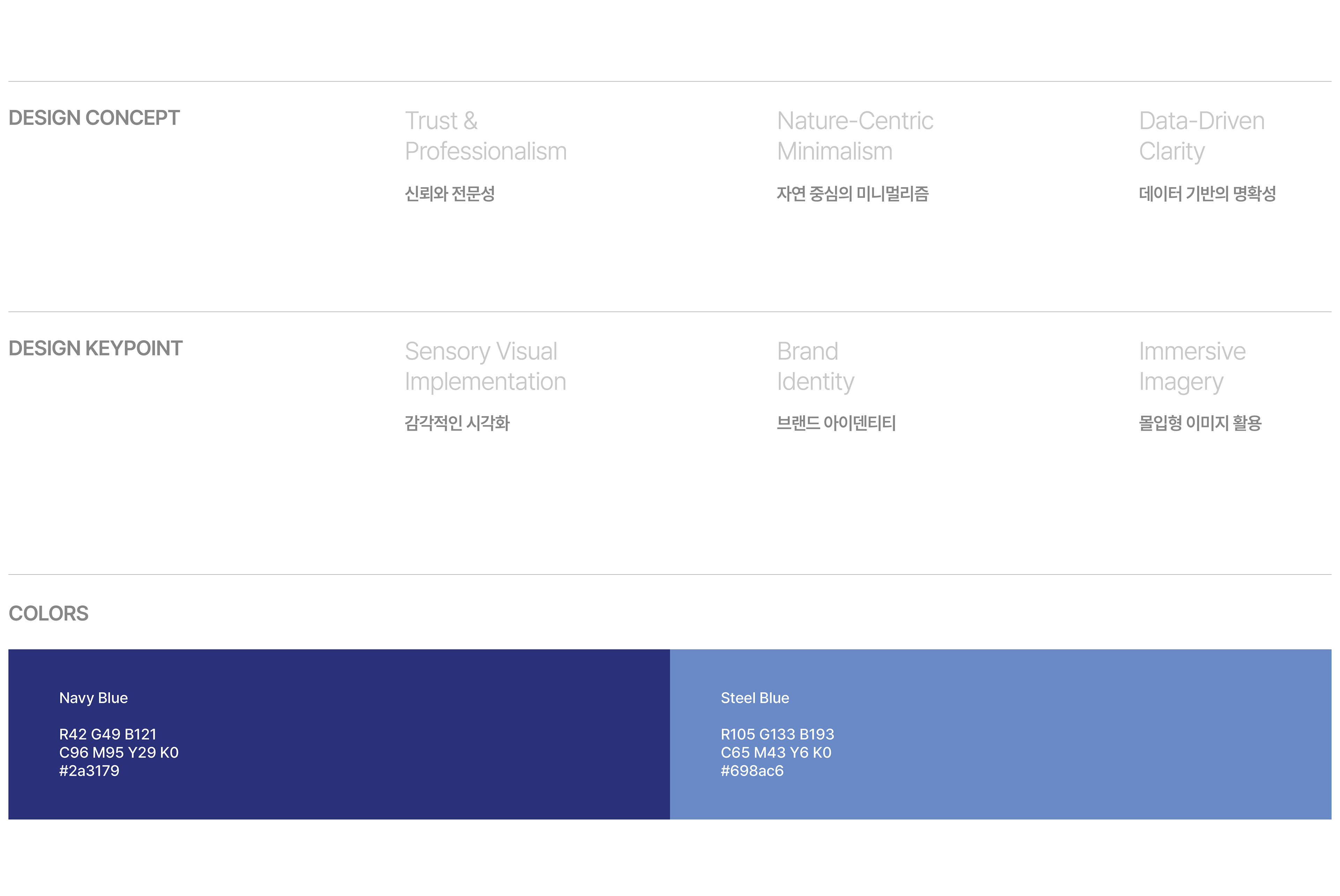
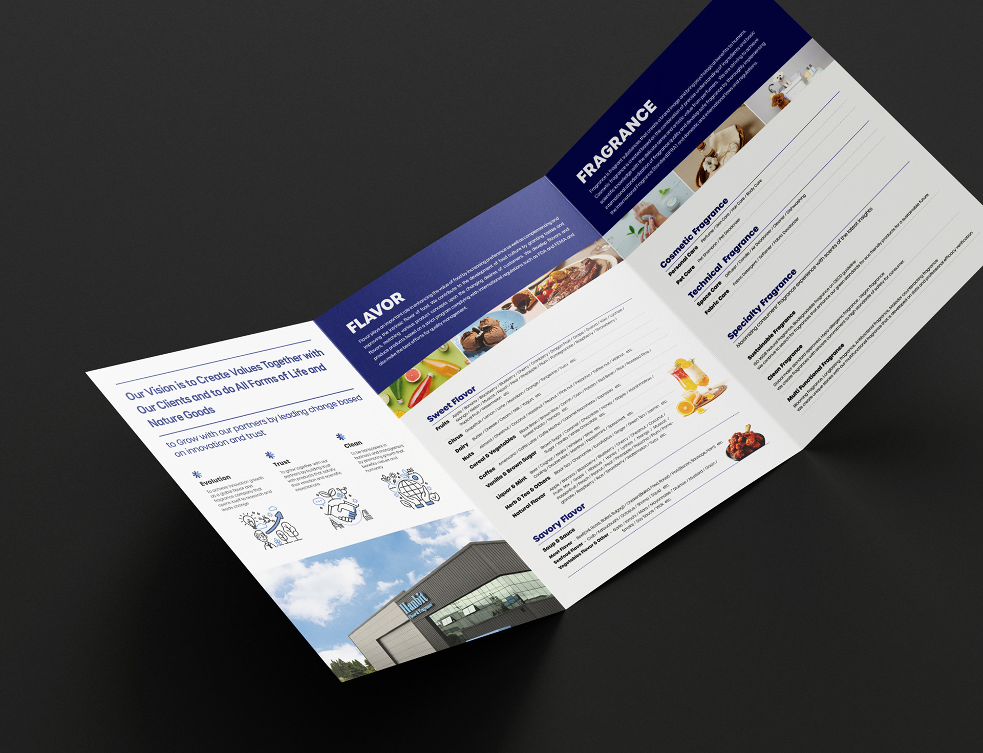
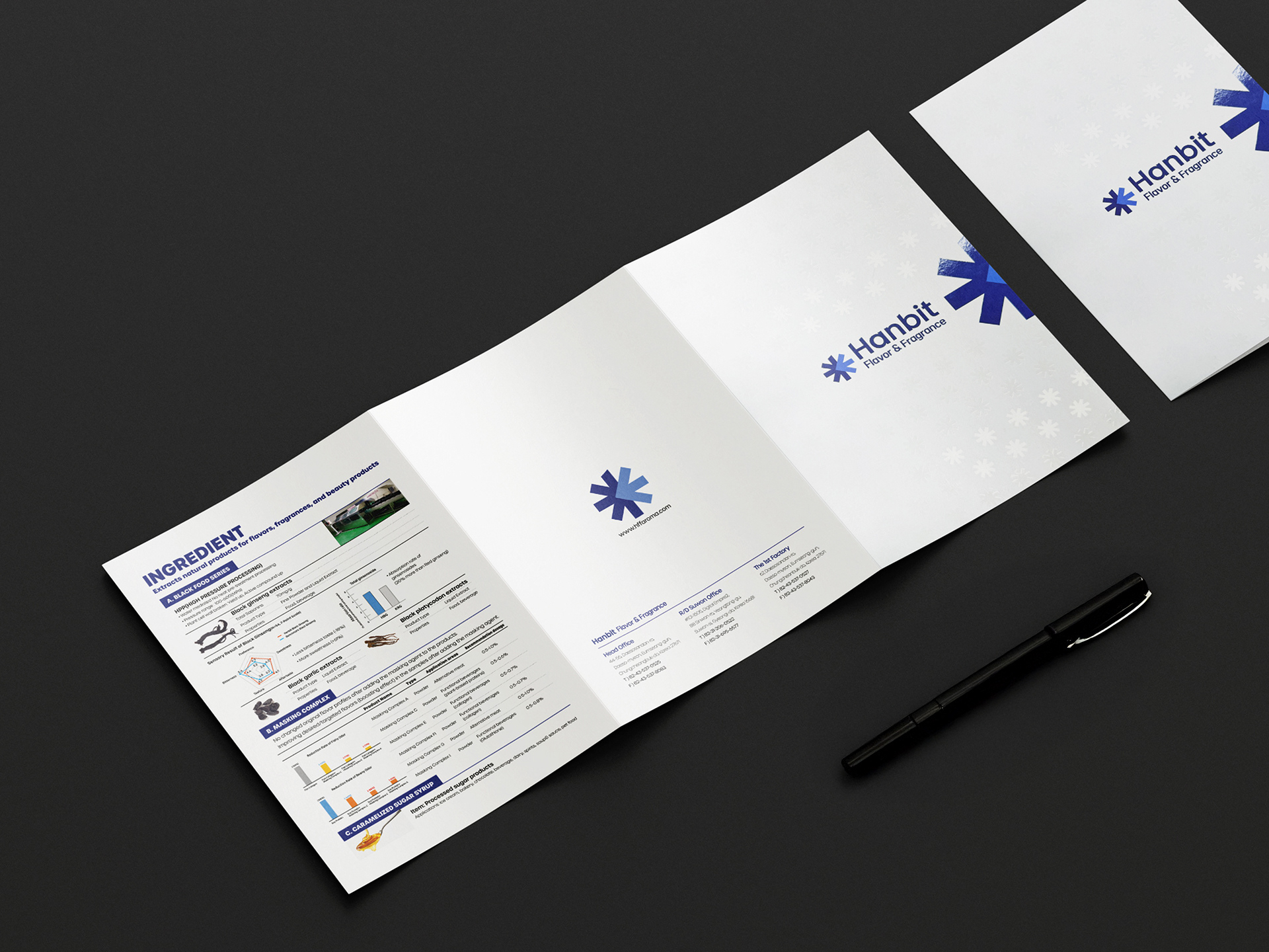
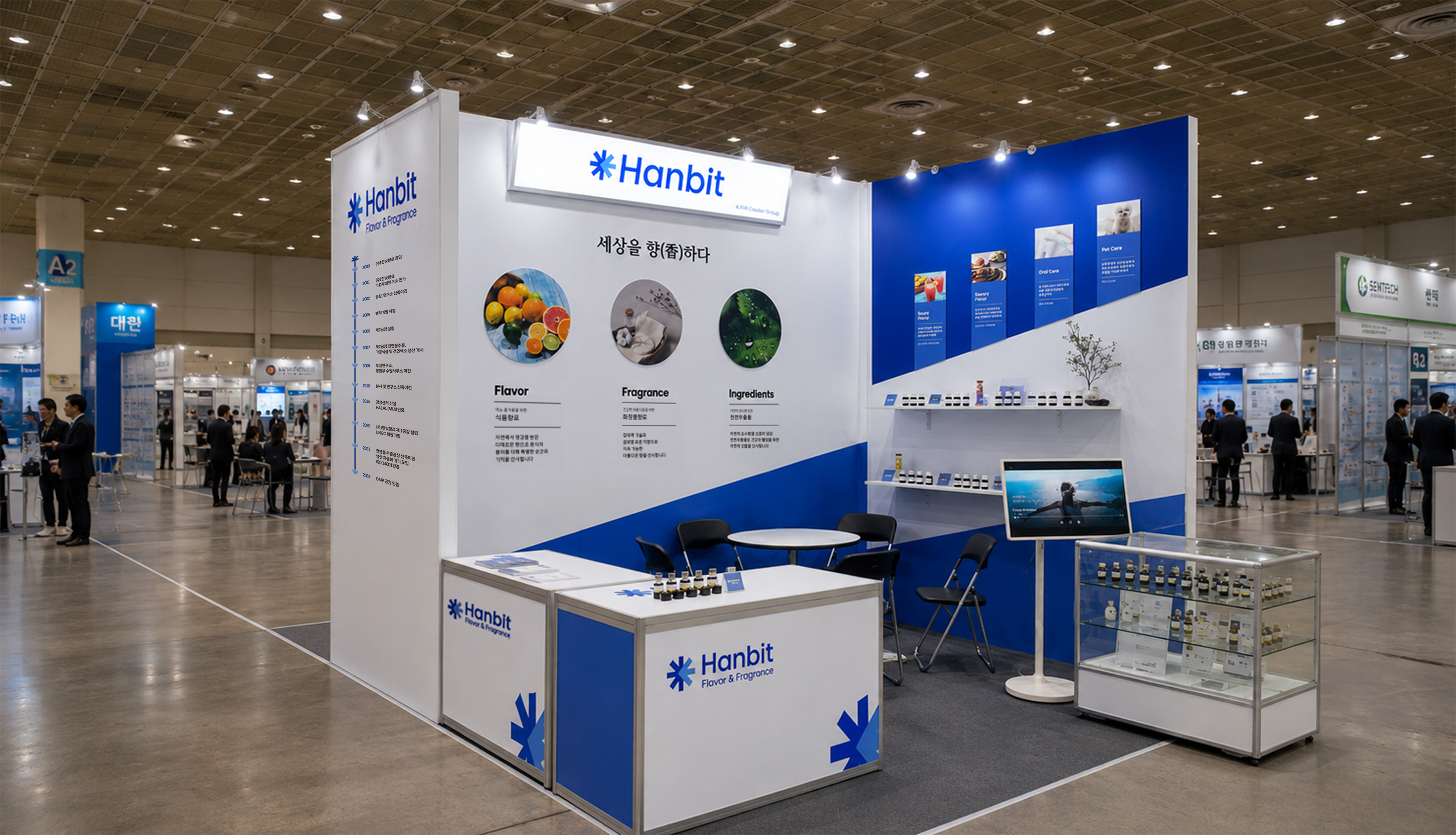
This leaflet emphasizes the professionalism and reliability of Hanbit fragrance by visualizing the "harmony between nature and technology." It solidifies the company's identity by using Deep Blue as a point color against a clean white background, and systematically arranges rich product images and data to enhance information delivery. Furthermore, based on the leaflet design concept, the planning and construction of the COEX exhibition booth were successfully linked and carried out.
본 리플렛은 '자연과 기술의 조화'를 시각화하여 한빛향료의 전문성과 신뢰도를 강조합니다. 깔끔한 화이트 배경에 딥 블루(Deep Blue)를 포인트 컬러로 활용해 기업의 정체성을 확고히 했으며, 풍부한 제품 이미지와 데이터를 체계적으로 배치해 정보 전달력을 높였습니다. 나아가 이 리플렛 디자인 콘셉트를 바탕으로 코엑스 전시 부스의 기획부터 시공까지 성공적으로 연계·진행되었습니다.
Hanbit Leaflet 2024
Year : 2024
Client : Hanbit
Services : Leaflet Design
Design : Soo Design Communication