

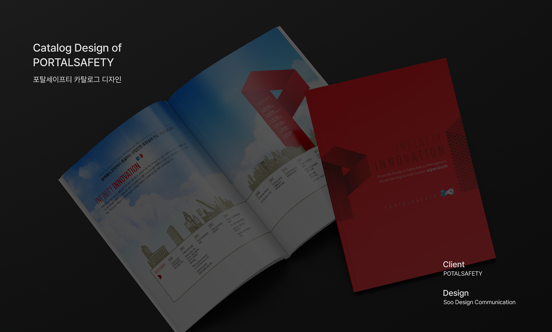
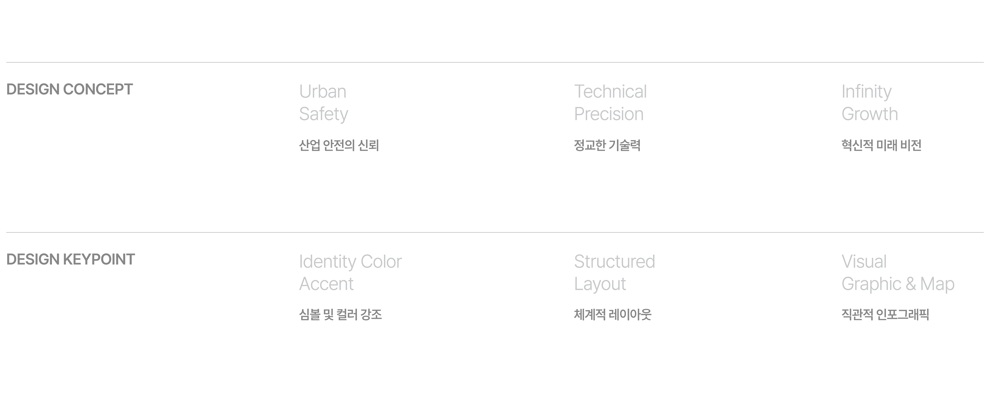
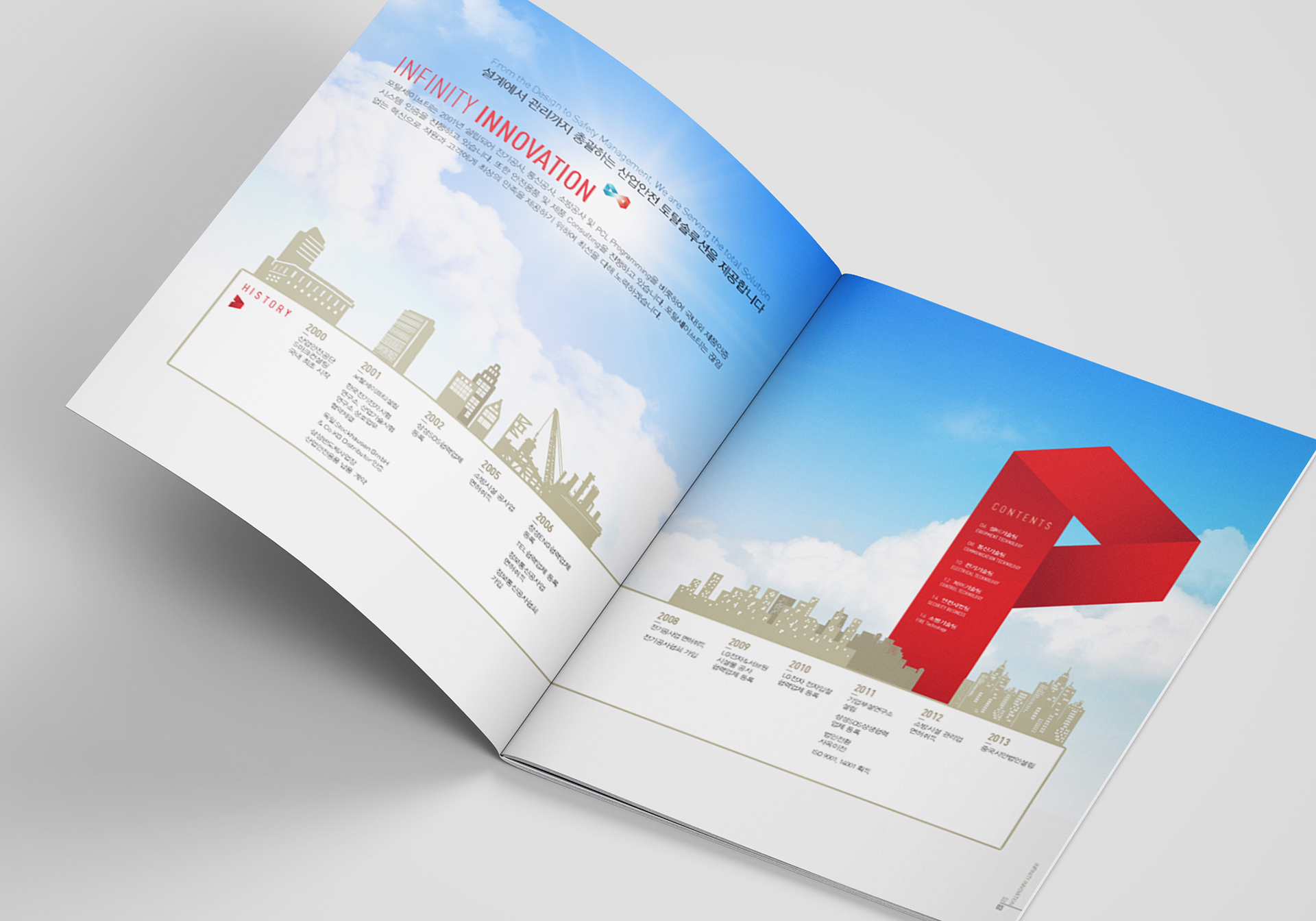
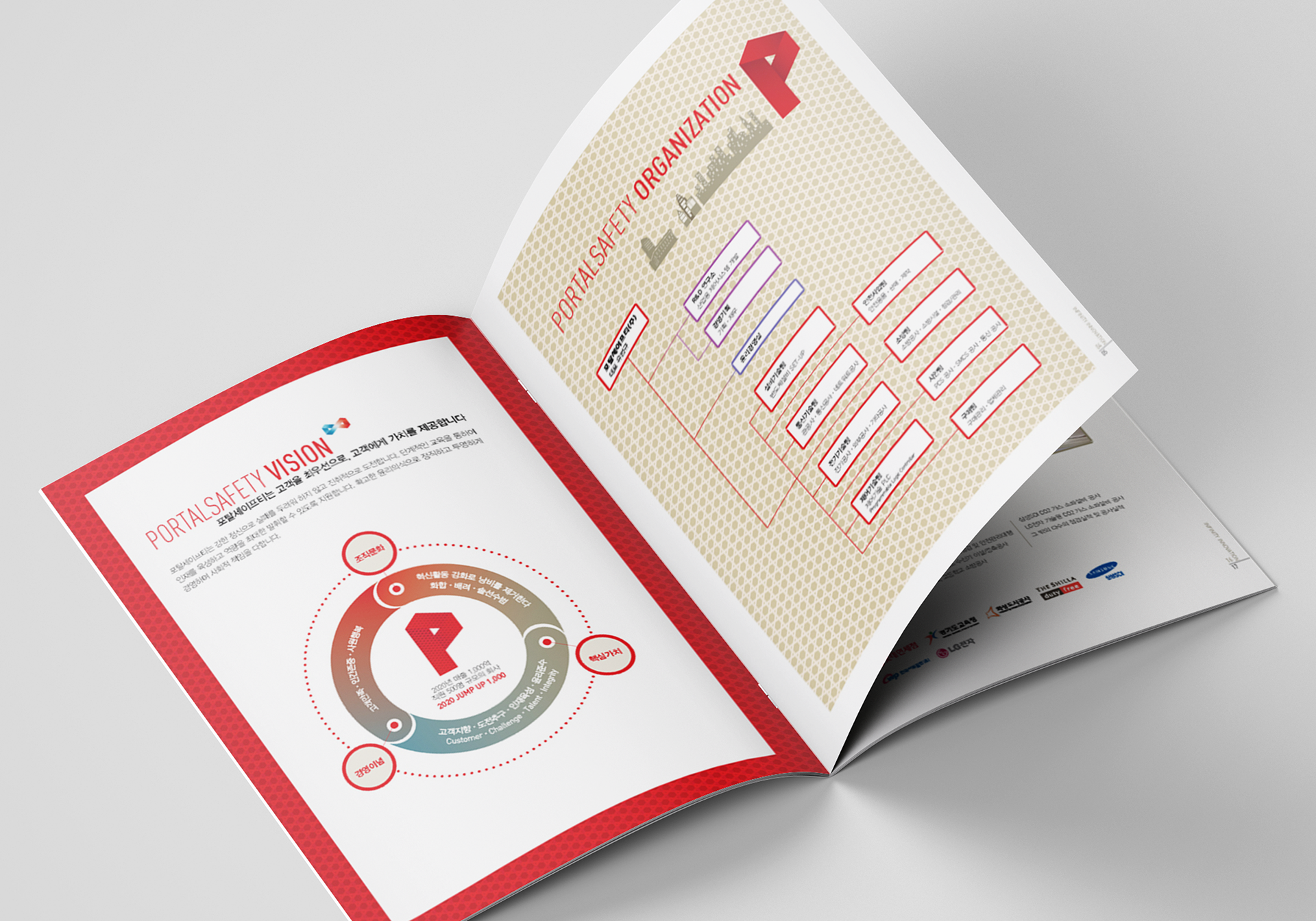
Portal Safety's catalog design uses 'P' graphic motifs and reliable reds as the main colors to convey the company's expertise and identity, and places specialized quantitative data such as history and organizational charts in an organized grid layout.
포탈세이프티의 카탈로그 디자인으로 'P' 그래픽 모티프와 신뢰감을 주는 레드를 메인 컬러로 활용하여 기업의 전문성과 정체성을 전달하고 연혁, 조직도 등 전문화된 정량 데이터와 현장 이미지를 정돈된 그리드 레이아웃으로 배치했습니다.
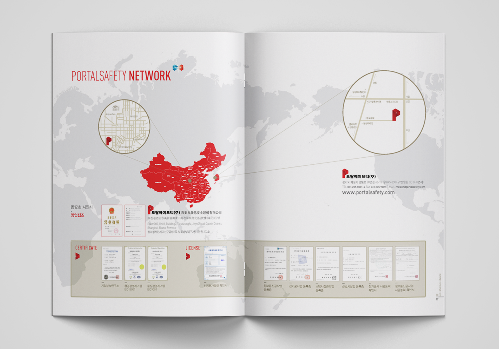
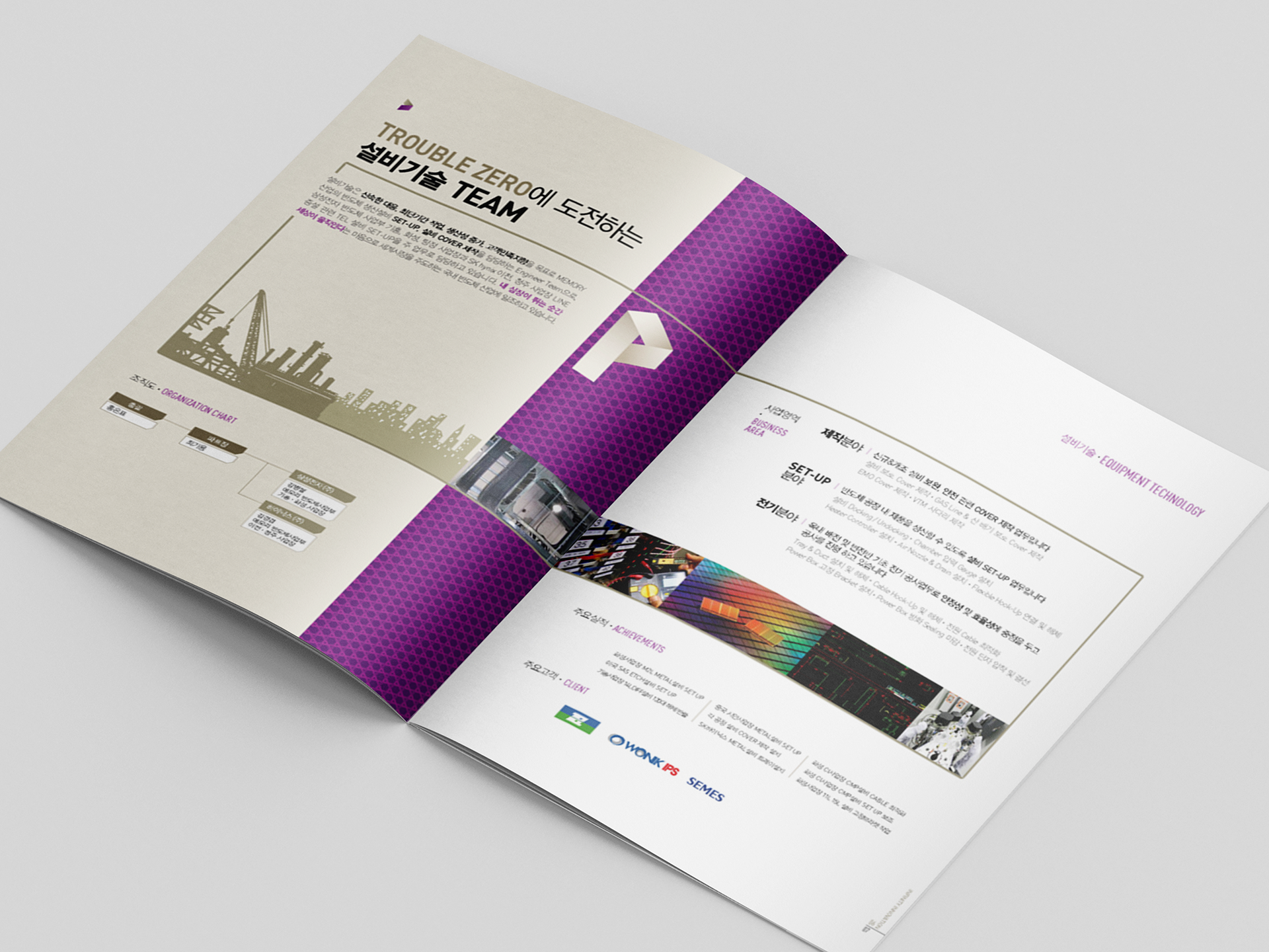
PORTALSAFETY Catalog 2019
Year : 2019
Client : PORTALSAFETY
Services : Catalog Design
Design : Soo Design Communication