
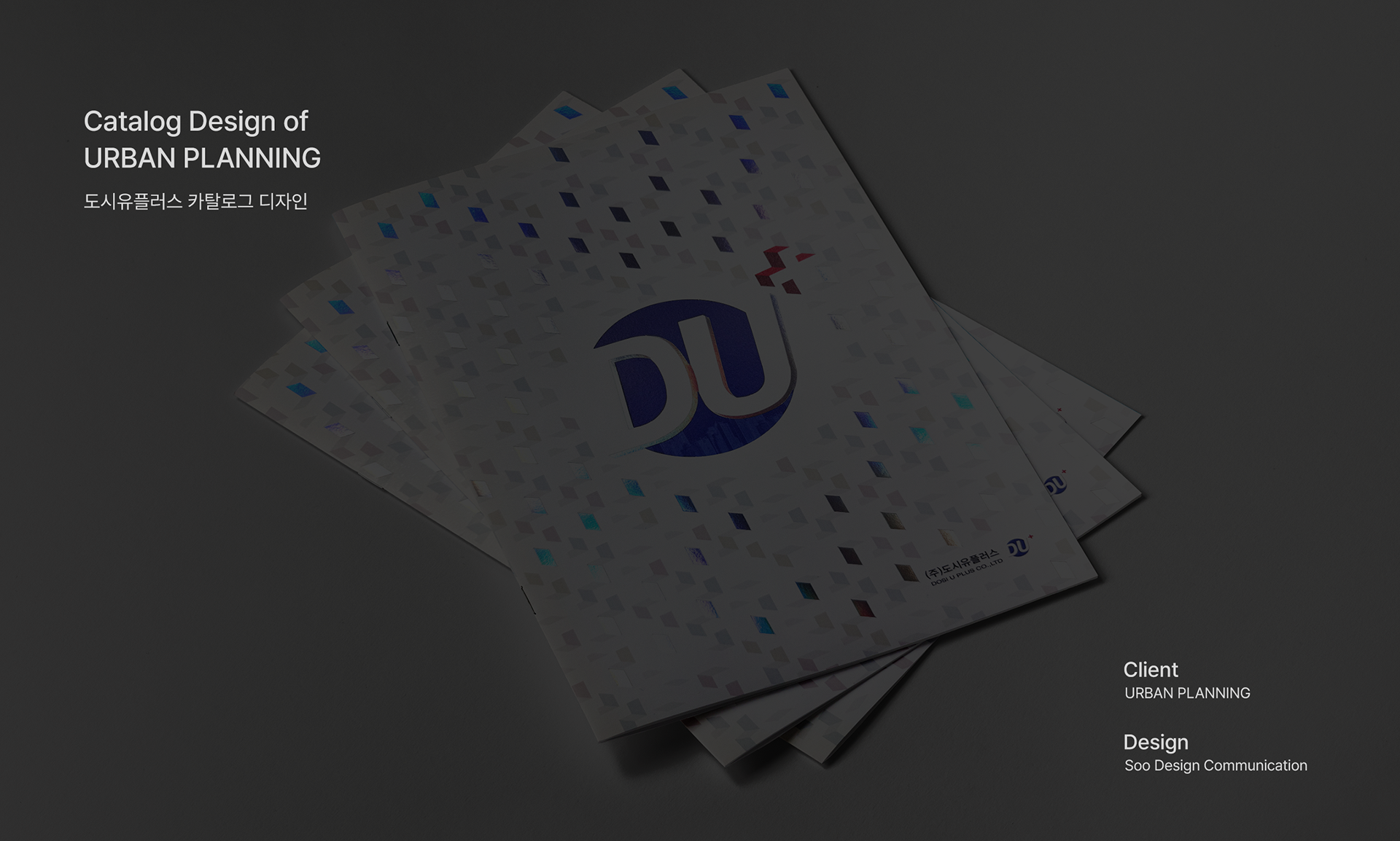
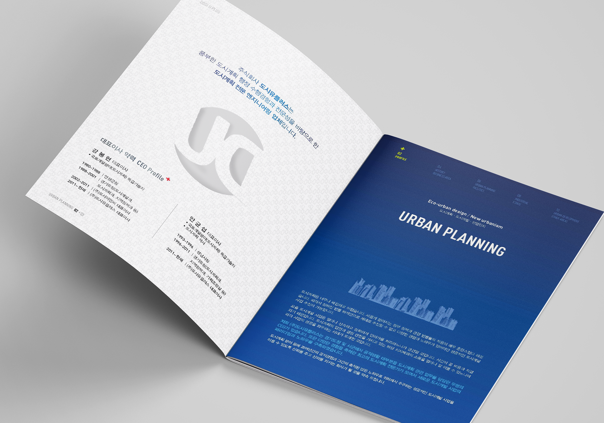
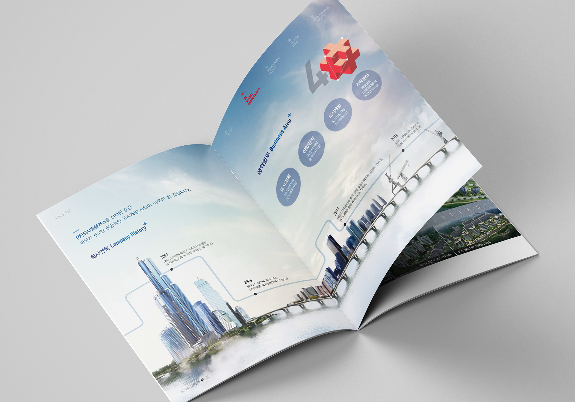
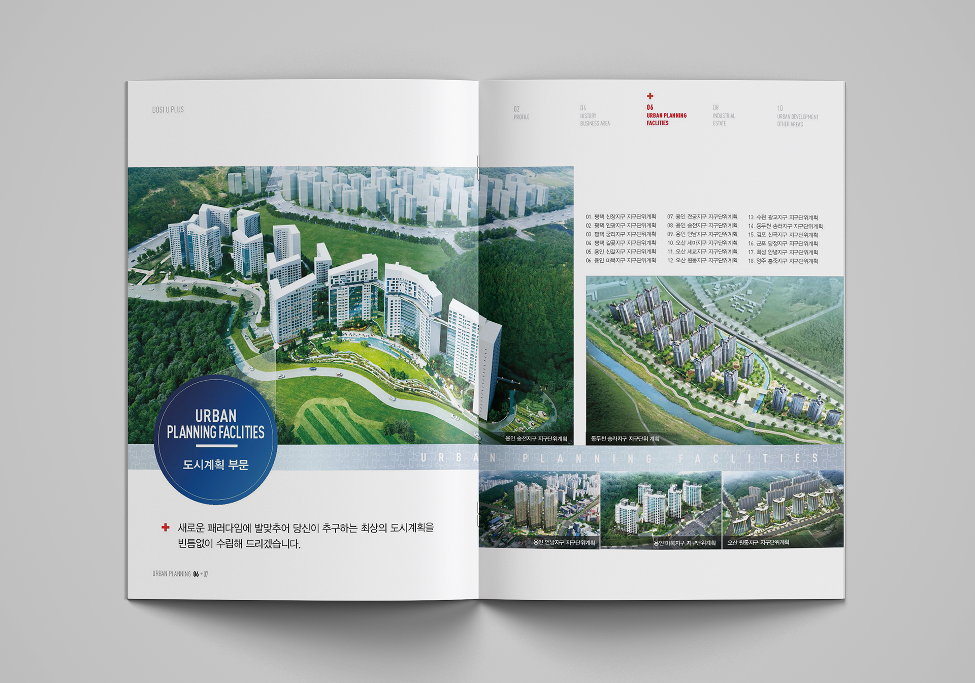
The city Uplus catalog has applied blue colors overall to emphasize the trustworthiness of the company. Based on the design using the company's logo symbols, the cover added a circular Domusong (shape pressure/perforation) and silver foil processing to give it a visual point.
도시유플러스 카탈로그는 기업의 신뢰감을 강조하기 위해 전체적으로 블루 컬러를 적용했습니다. 표지에는 업체 로고의 심볼을 활용한 디자인을 바탕으로, 원형 도무송(형압/타공)과 은박 가공을 더해 시각적인 포인트를 주었습니다.
URBAN PLANNING Catalog 2018
Year : 2018
Client : URBAN PLANNING
Services : Catalog Design
Design : Soo Design Communication