

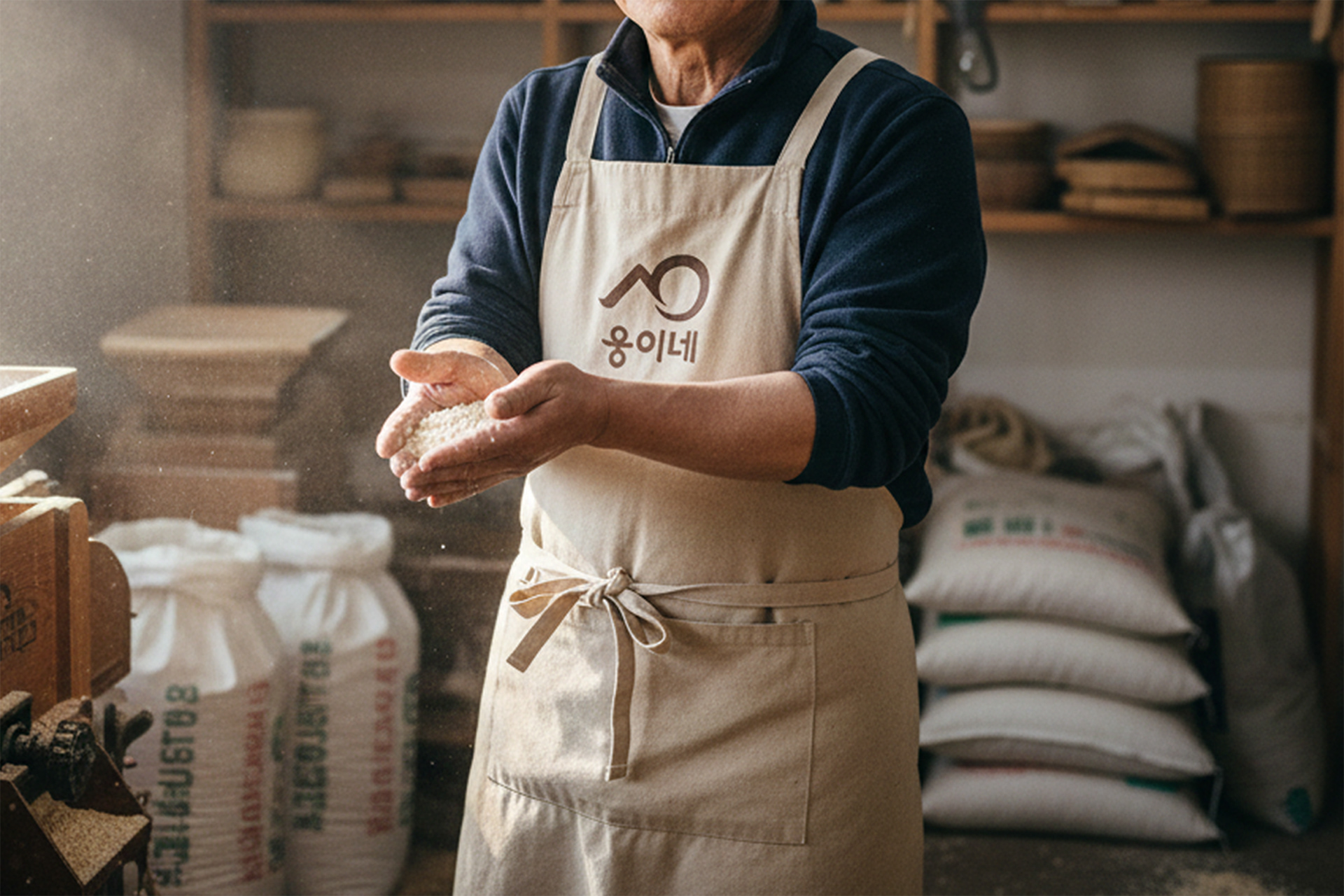
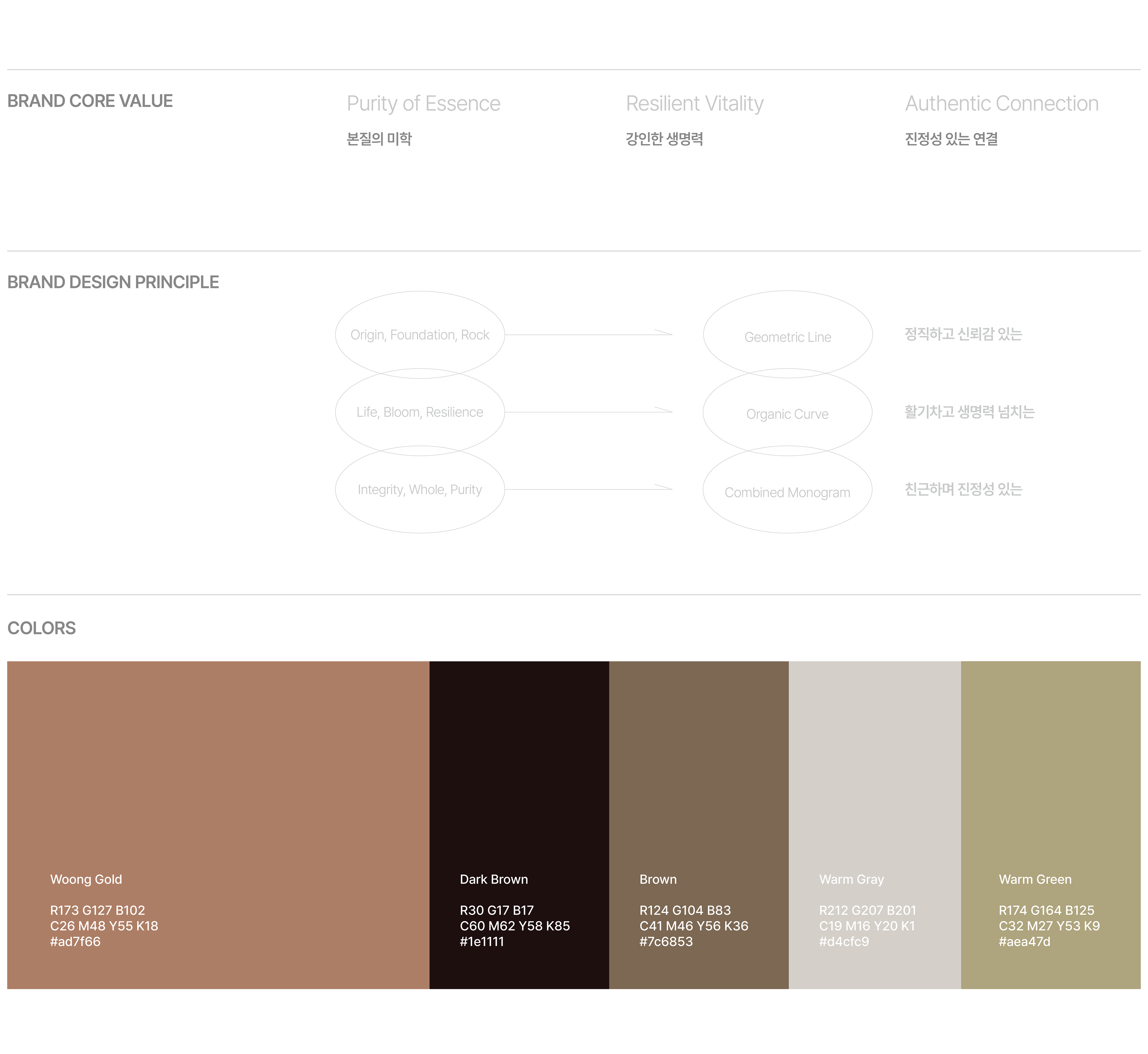
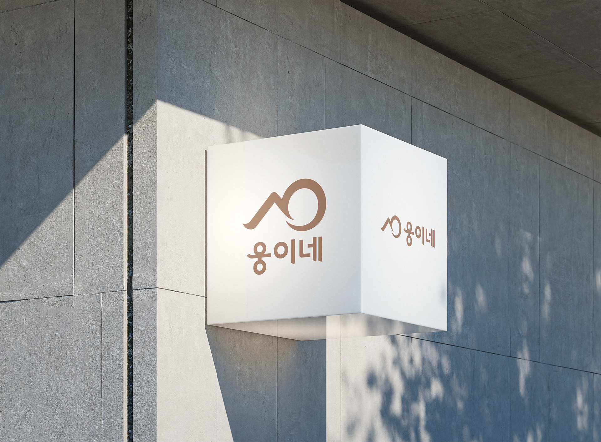
It was created by organically combining the consonants 'ㅅ' and ㅇ of "Seok" and "Oh (吳), the basis of Woong's brand. Just like a flower blooming through a barren heap of rubble, it symbolizes vitality and sincerity in creating the best value even in difficult environments. It is a minimal design that captures the brand's history and perseverance in the essential food of rice.
웅이네 브랜드의 근간인 '석(石, 돌)'과 '오(吳, 성씨)'의 자음 'ㅅ'과 'ㅇ'을 유기적으로 결합하여 탄생했습니다. 척박한 돌무더기를 뚫고 피어난 한 송이 꽃처럼, 어려운 환경에서도 최고의 가치를 만들어내는 생명력과 정성을 상징합니다. 쌀이라는 본질적인 먹거리에 브랜드의 역사와 인내를 담아낸 미니멀한 디자인입니다.
Woong-e's family Brand Design 2022
Year : 2022
Client : Woong-e's family
Services : Brand Design
Design : Soo Design Communication